ALEX JIYUN LEE
ALEX JIYUN LEE




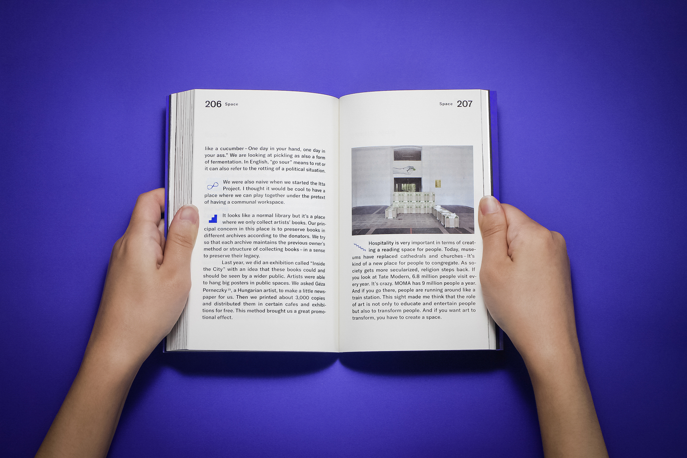

Art direction & Book design
BB2 ©2017
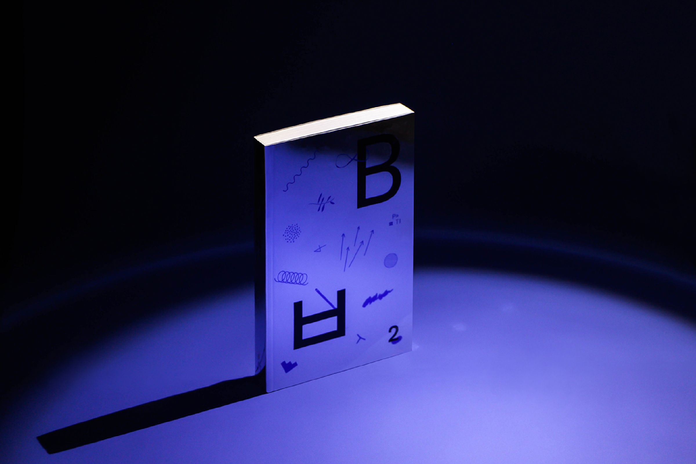
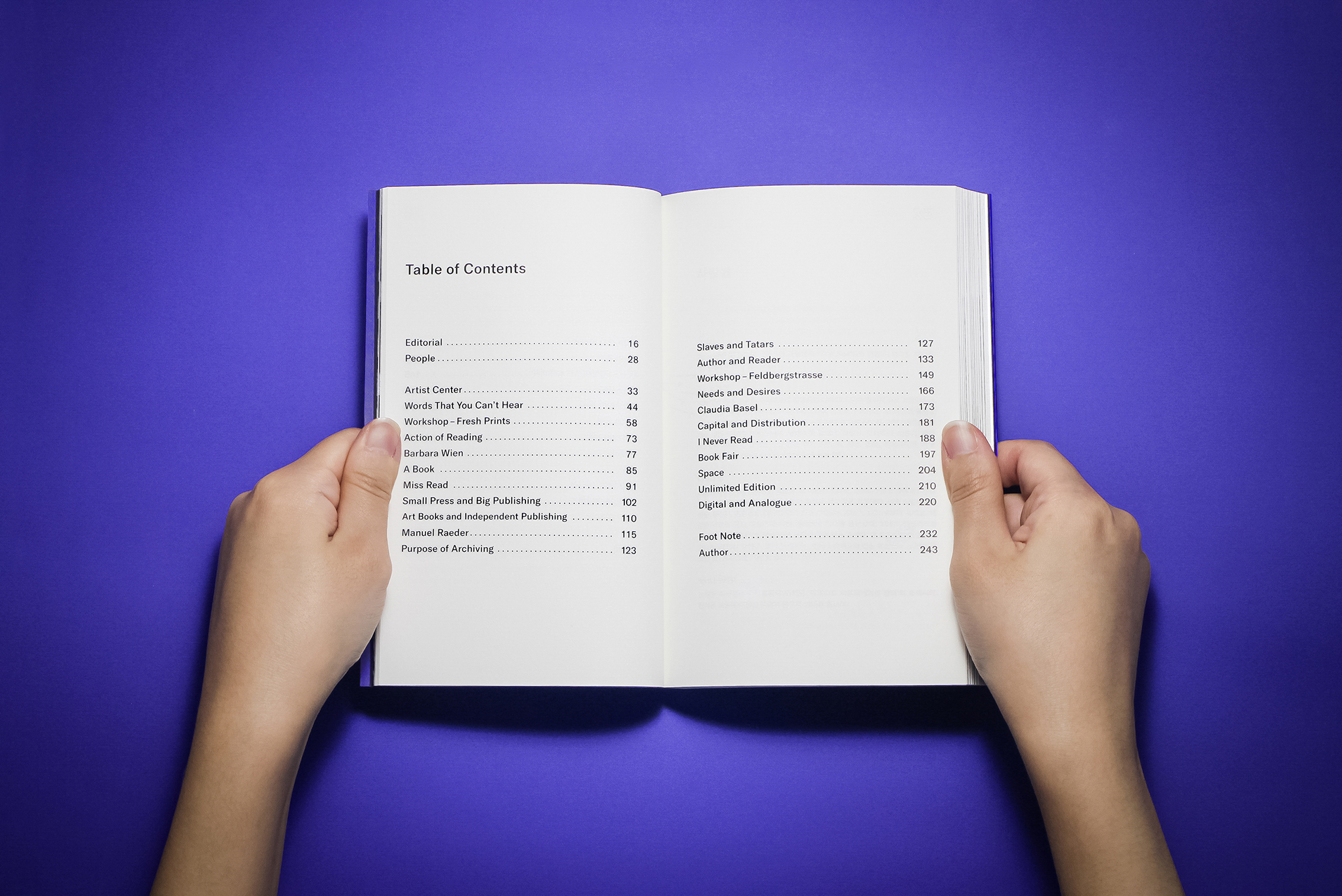
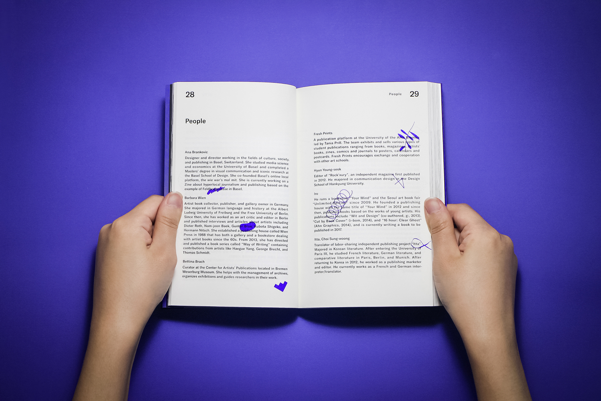
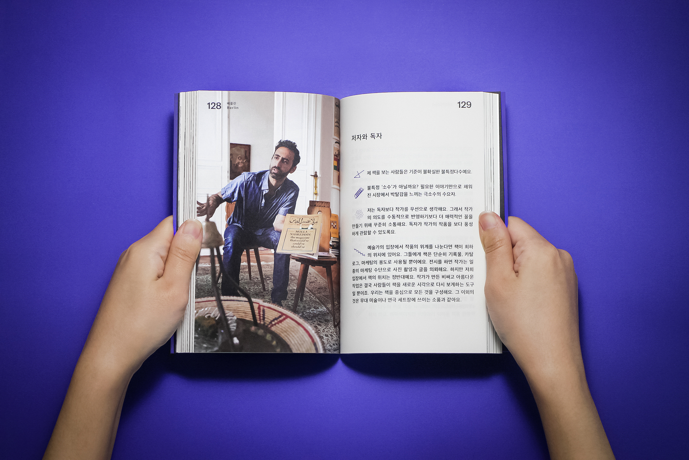
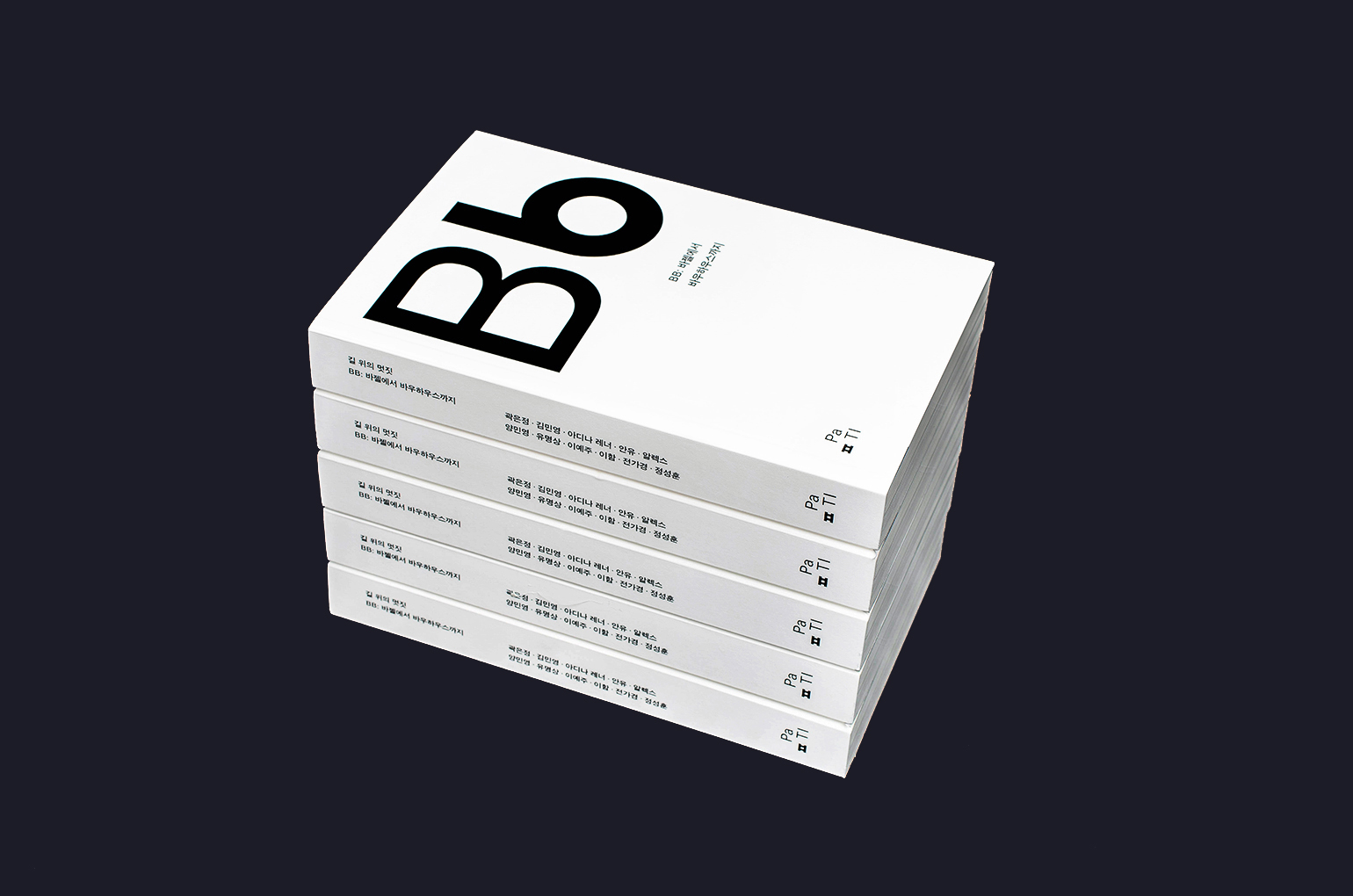
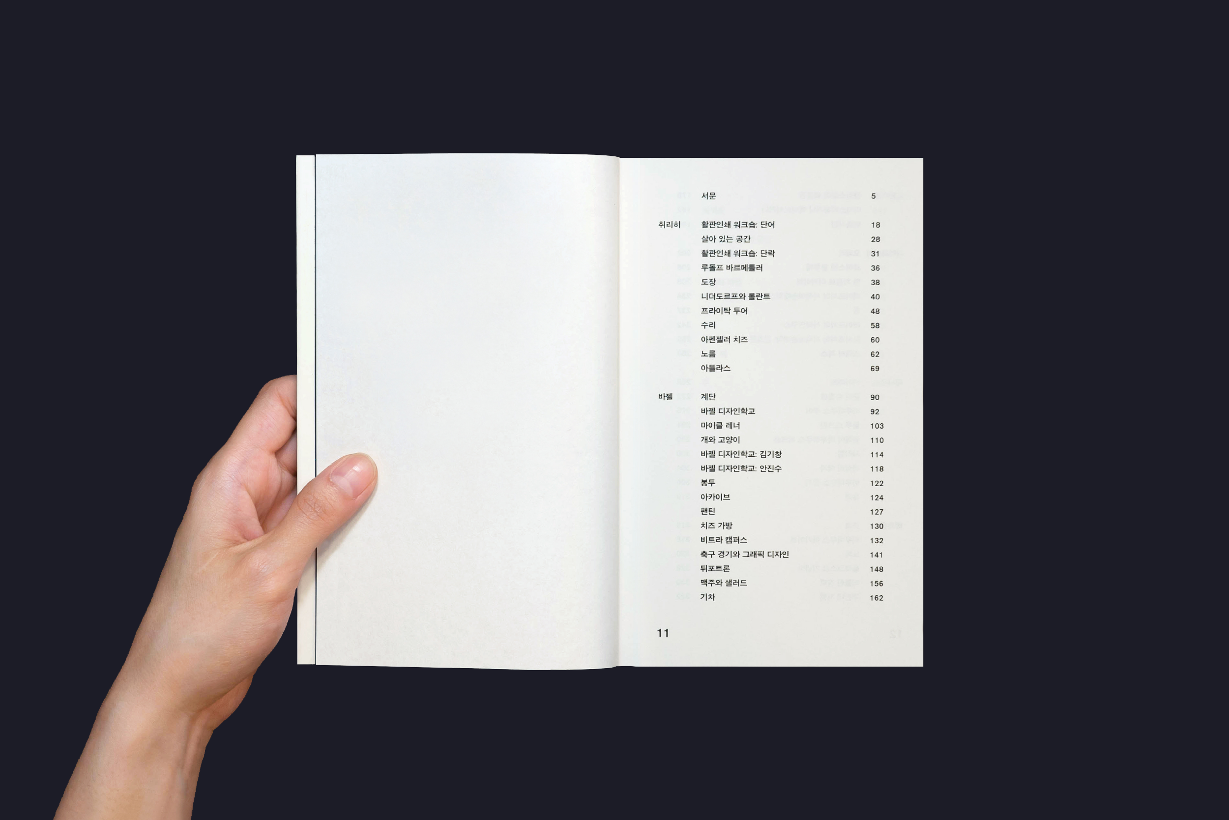
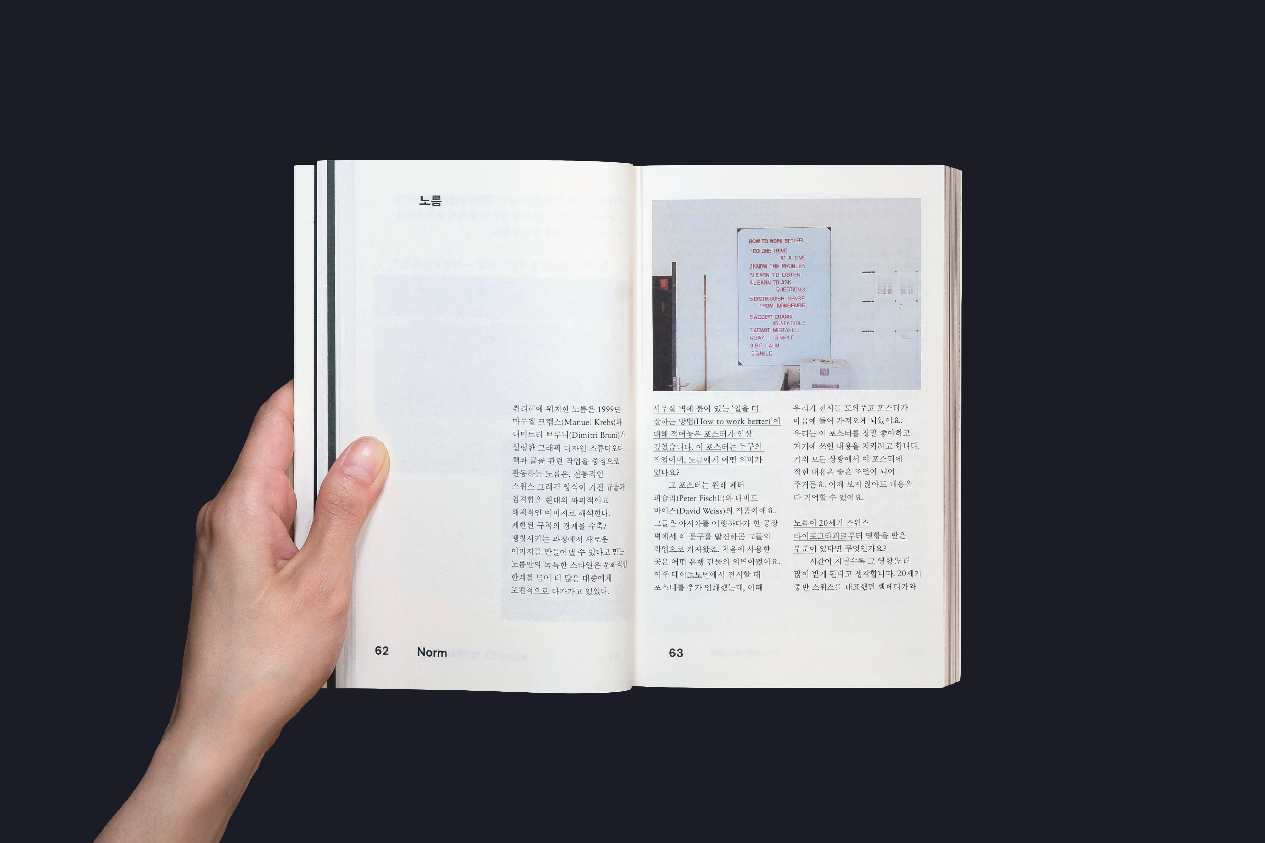
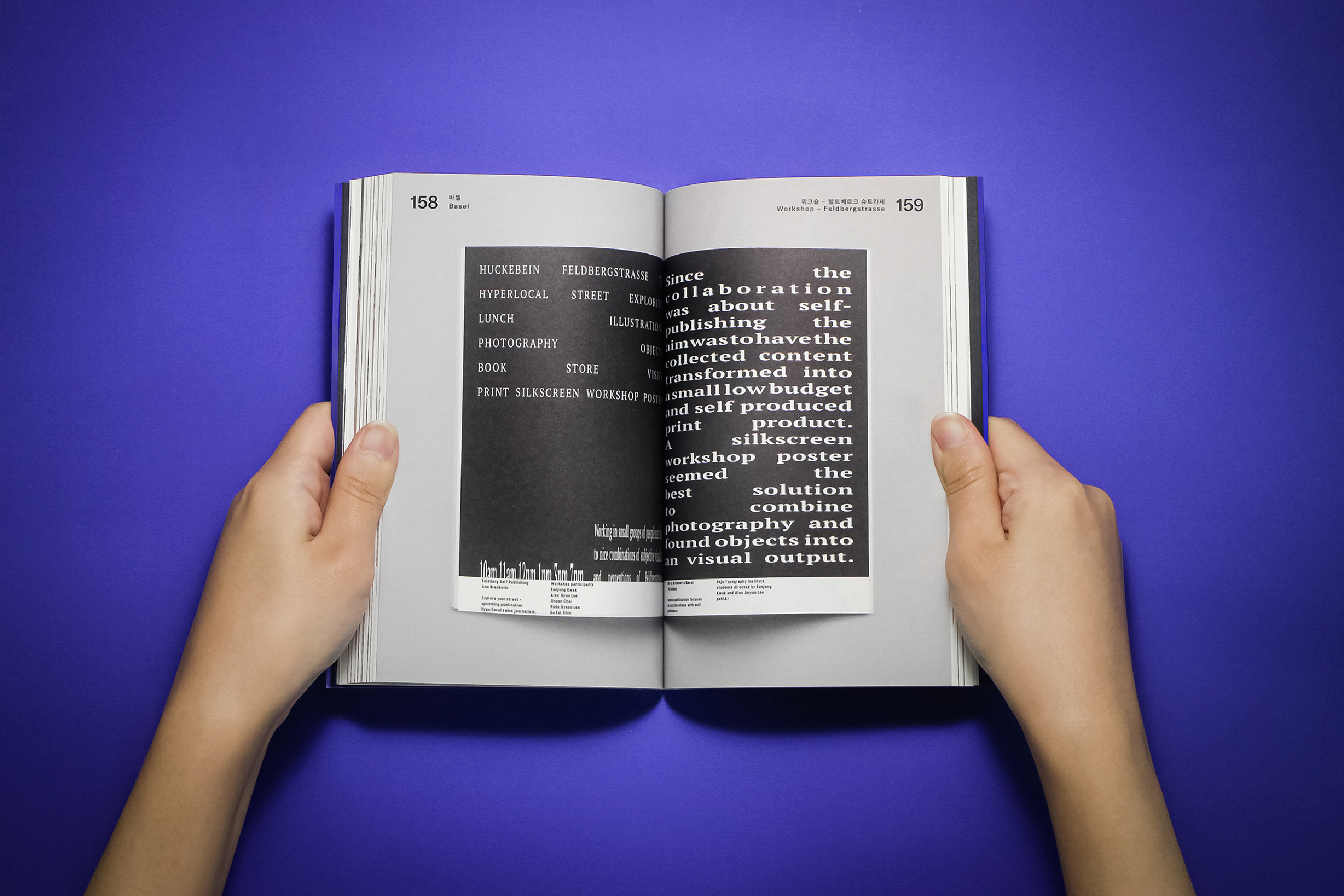
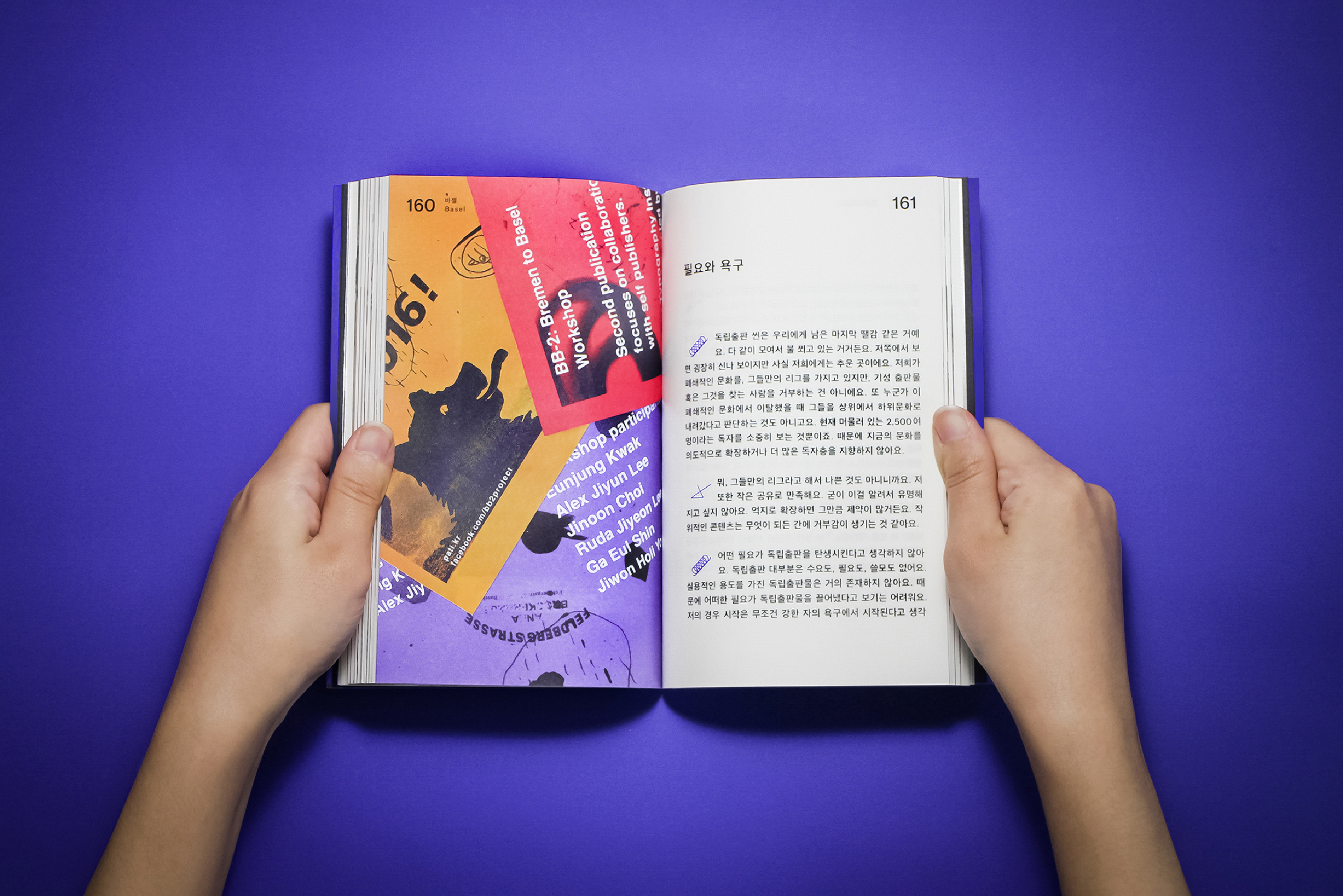
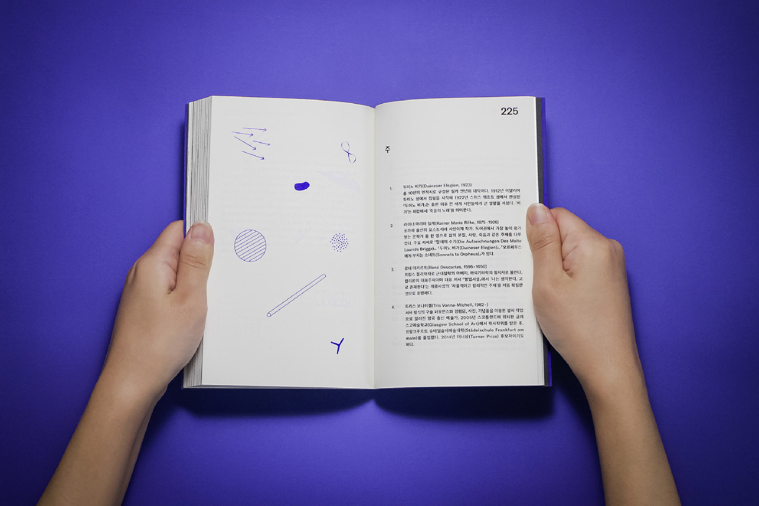
"BB2: From Bremen To Basel" was created as a part of Paju Typography Institute's regular curriculum, 'Design on the Road.' The project took place in three cities of Switzerland and Germany to explore the microcosm of independent publications through encounters made outside of the classroom. The experience was later documented as a publication, which primarily consists of three parts: interviews, workshops, and art book fairs. Independent interviews were conducted with individuals and collectives from various professional fields—self-publishers, bookshop owners, independent book project members, writers, artist book collectors, and book fair hosts—who were directly or indirectly connected to the subject matter. The contents were later recomposed under 12 different keywords. Although the project was initiated to scrutinize the independent publishing scene, the outcome of this exploration questions the role of the book and its possibility beyond.
︎ Collaborated with Eunjung Kwak, Gaeul Shin, Jiyeon Lee
115 x 178, Offset, 256pg








Book design & Illustration
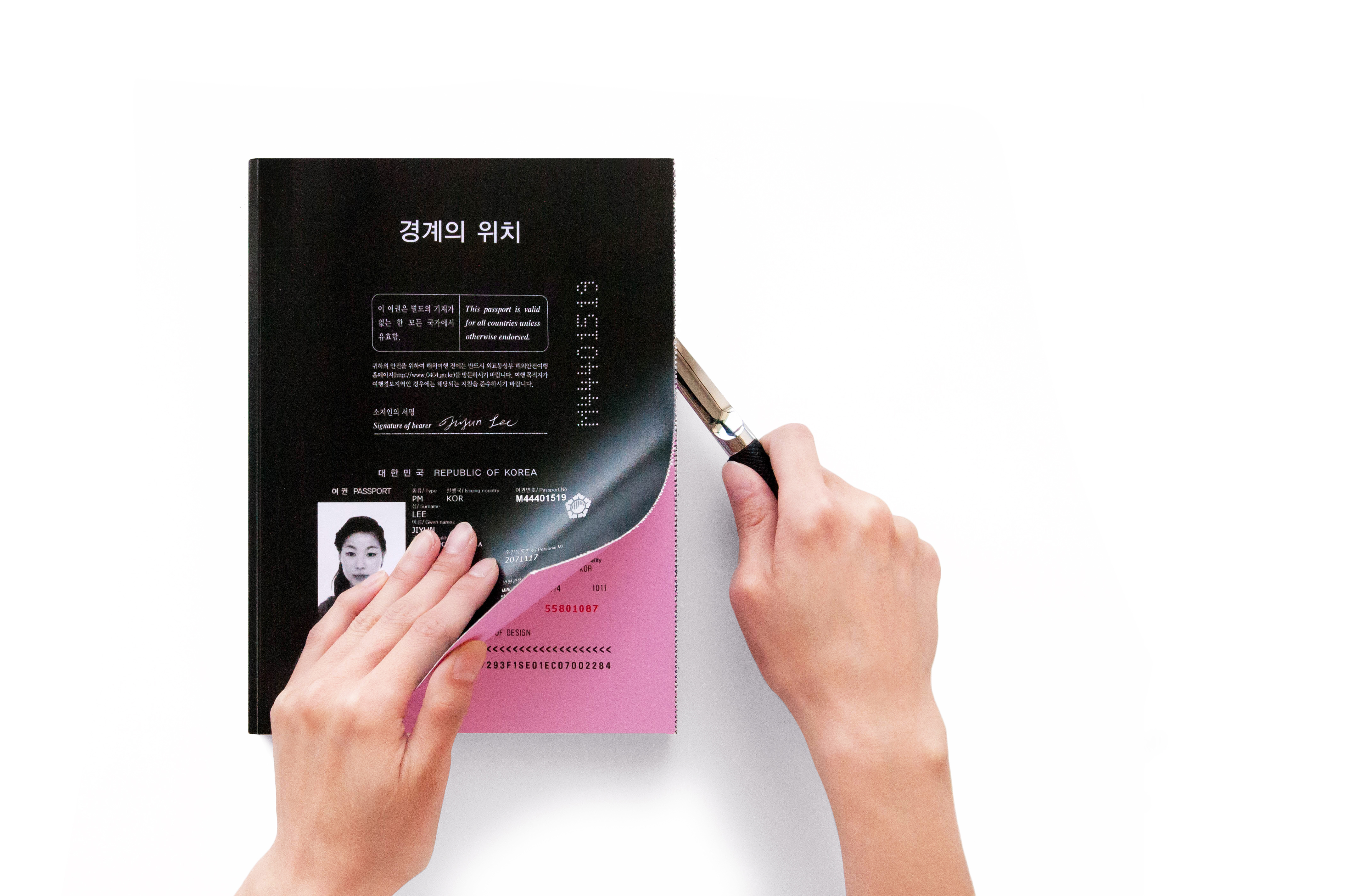
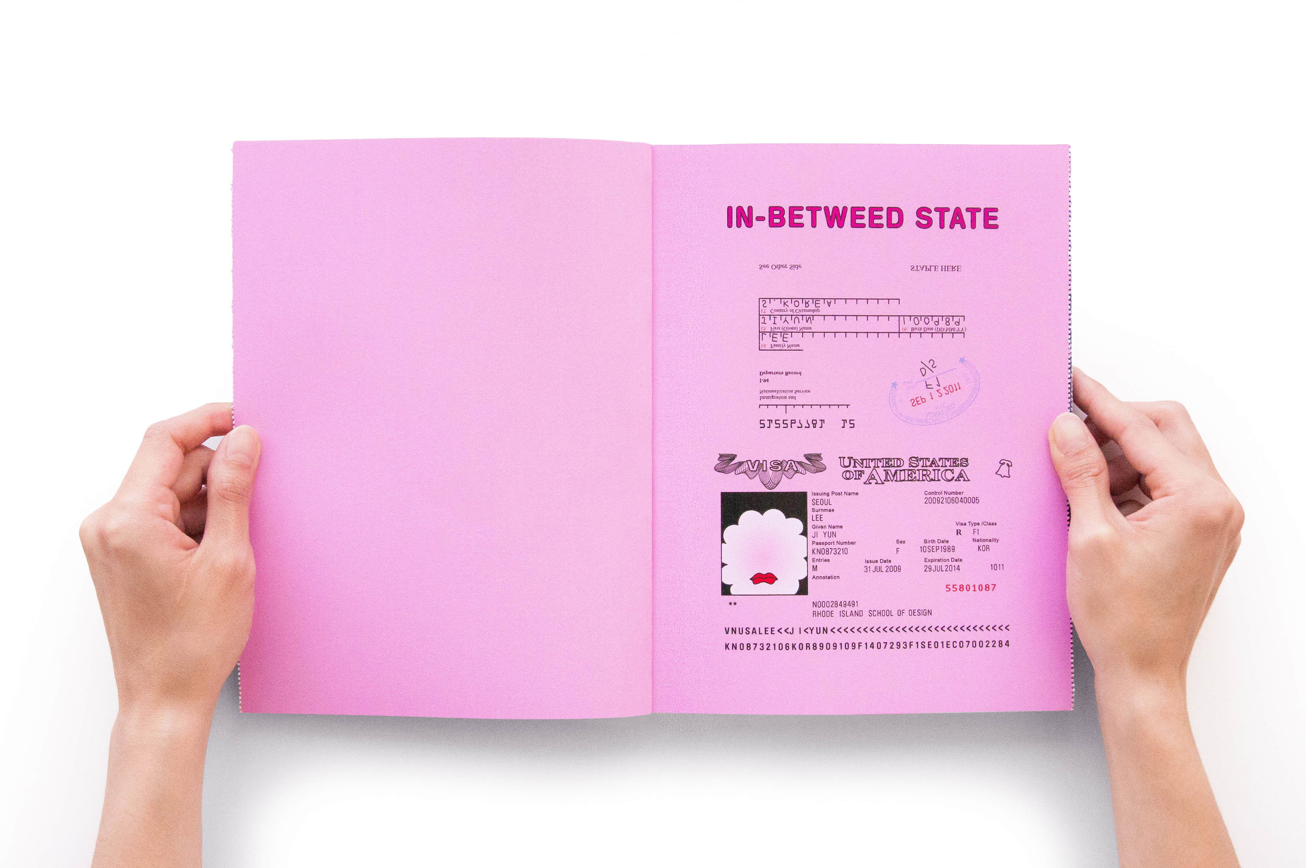
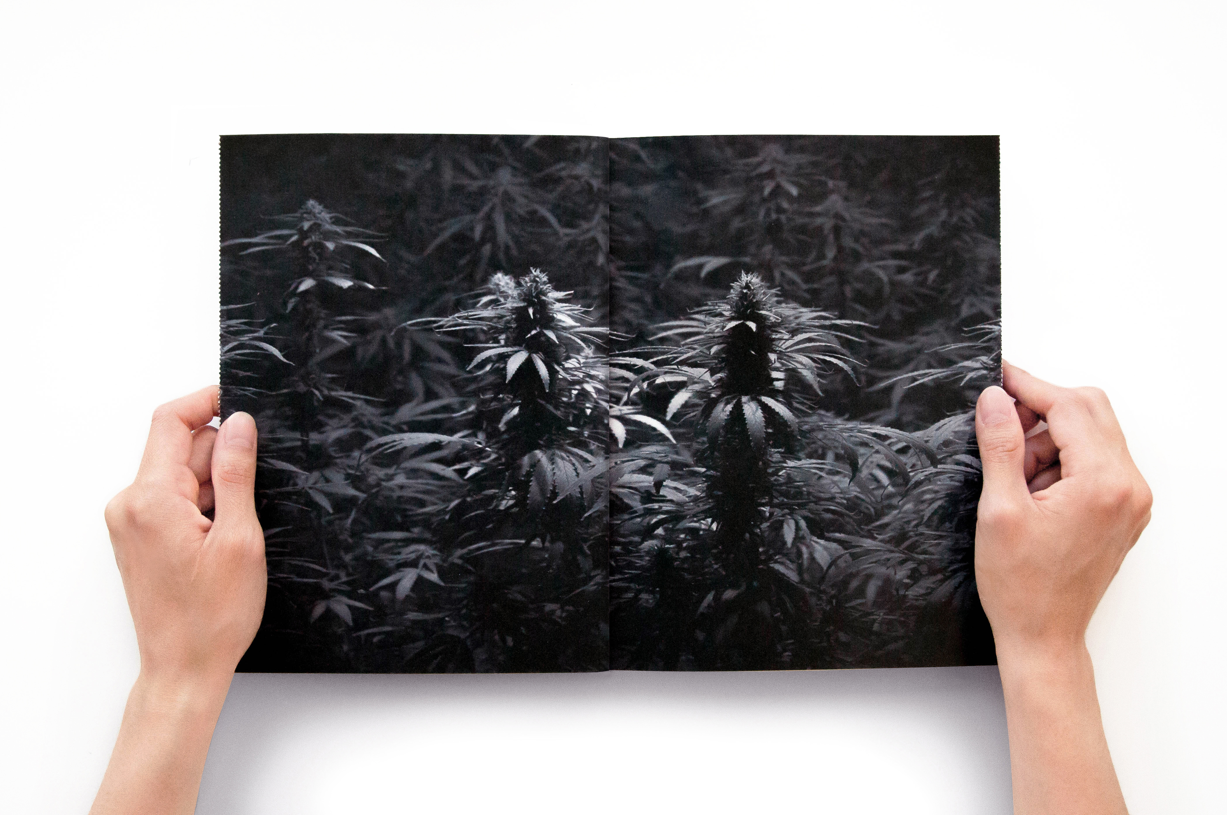
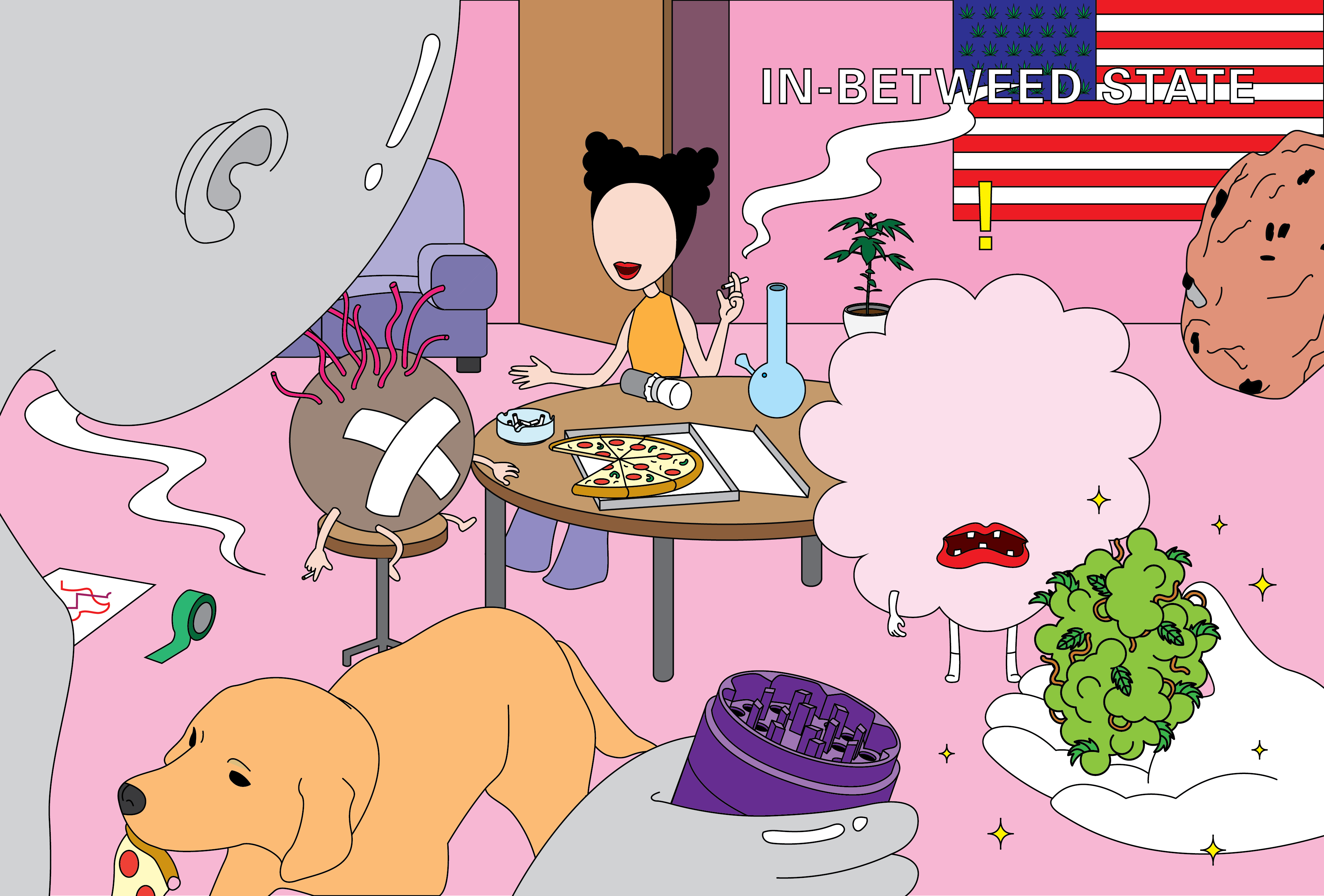
In-betweed State ©2016
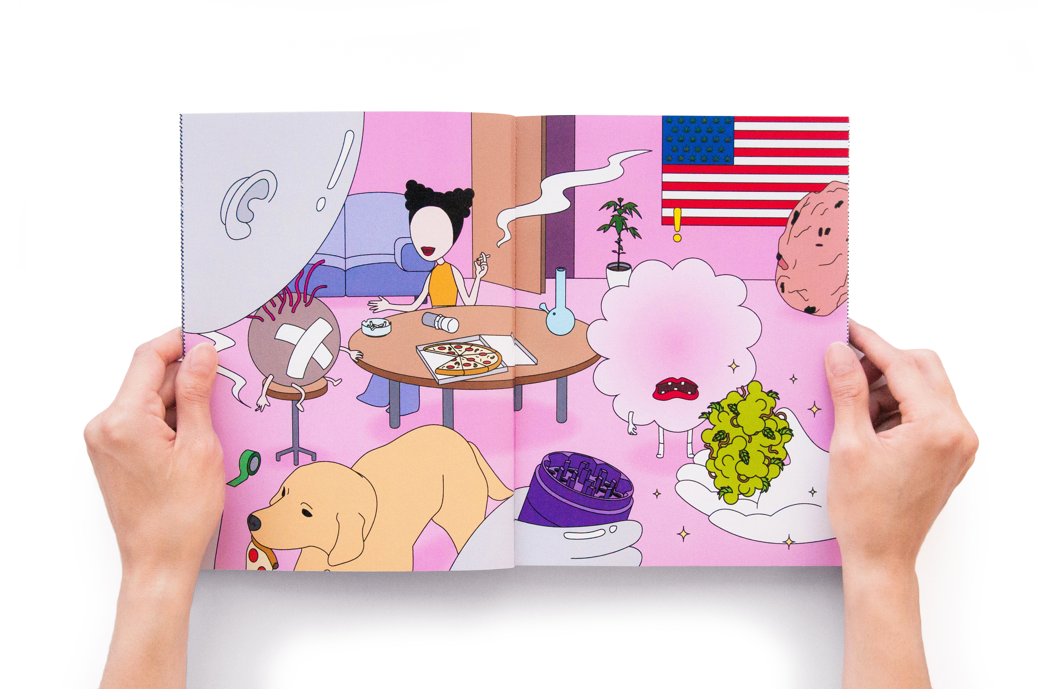
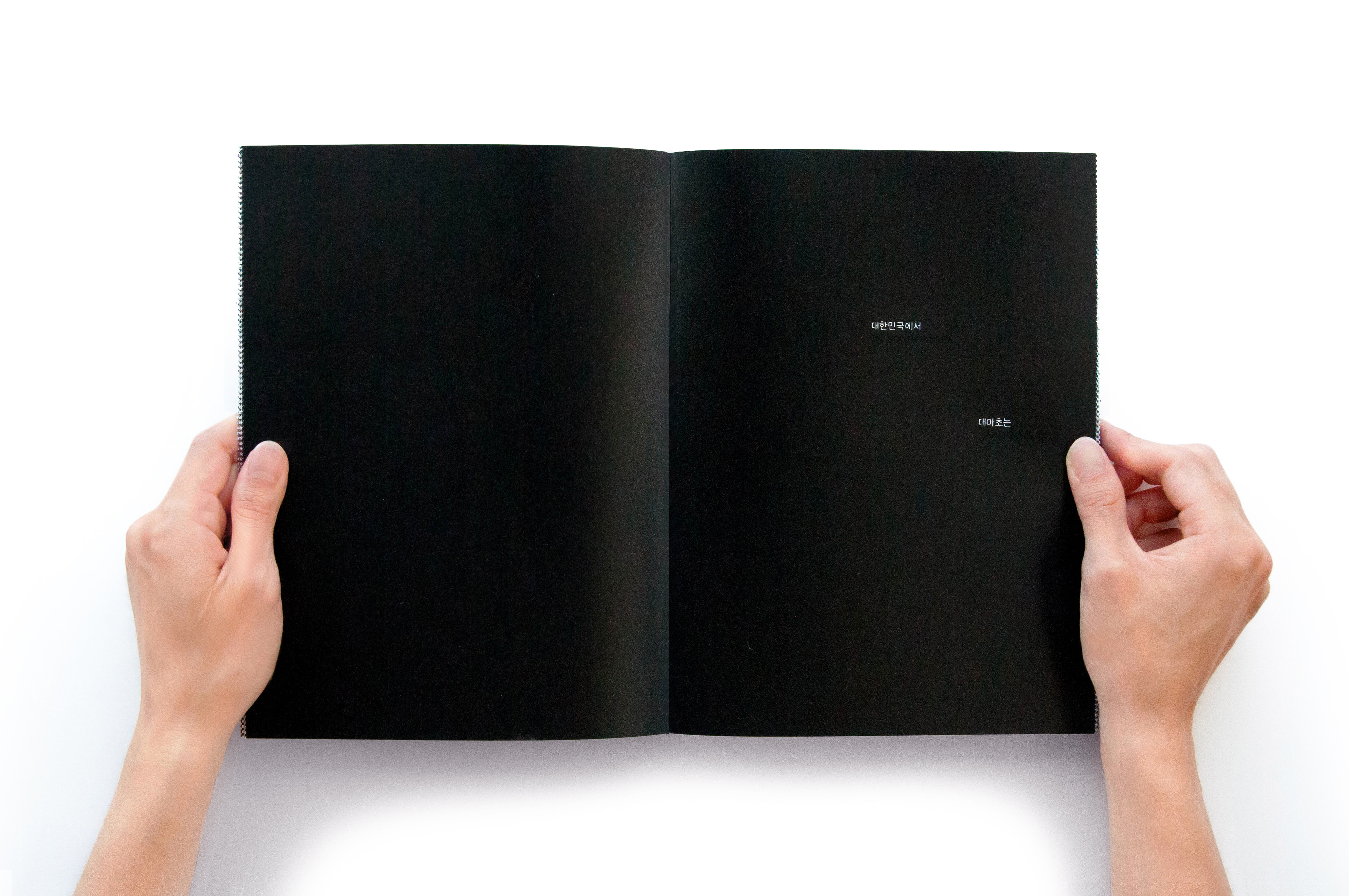
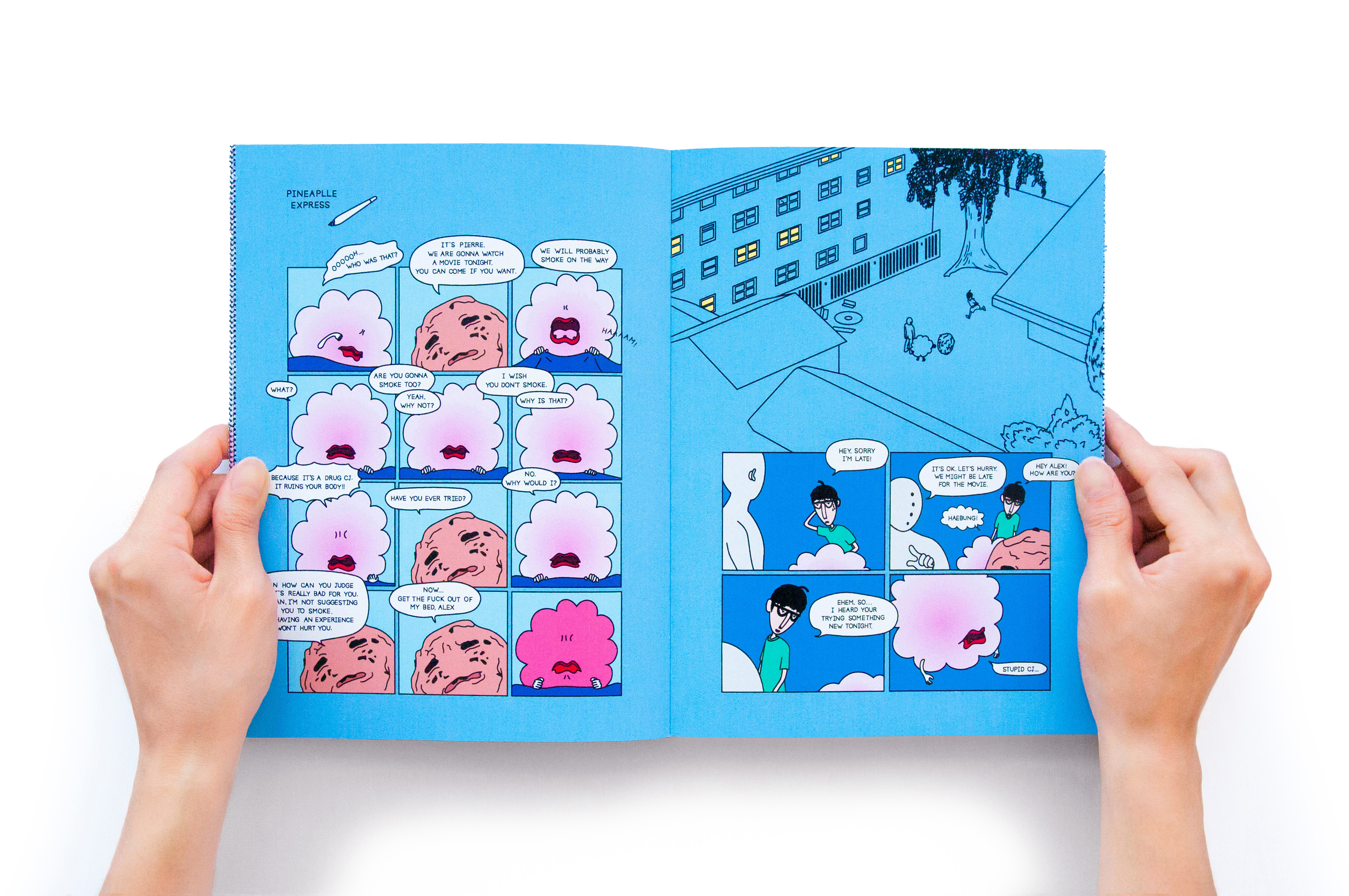
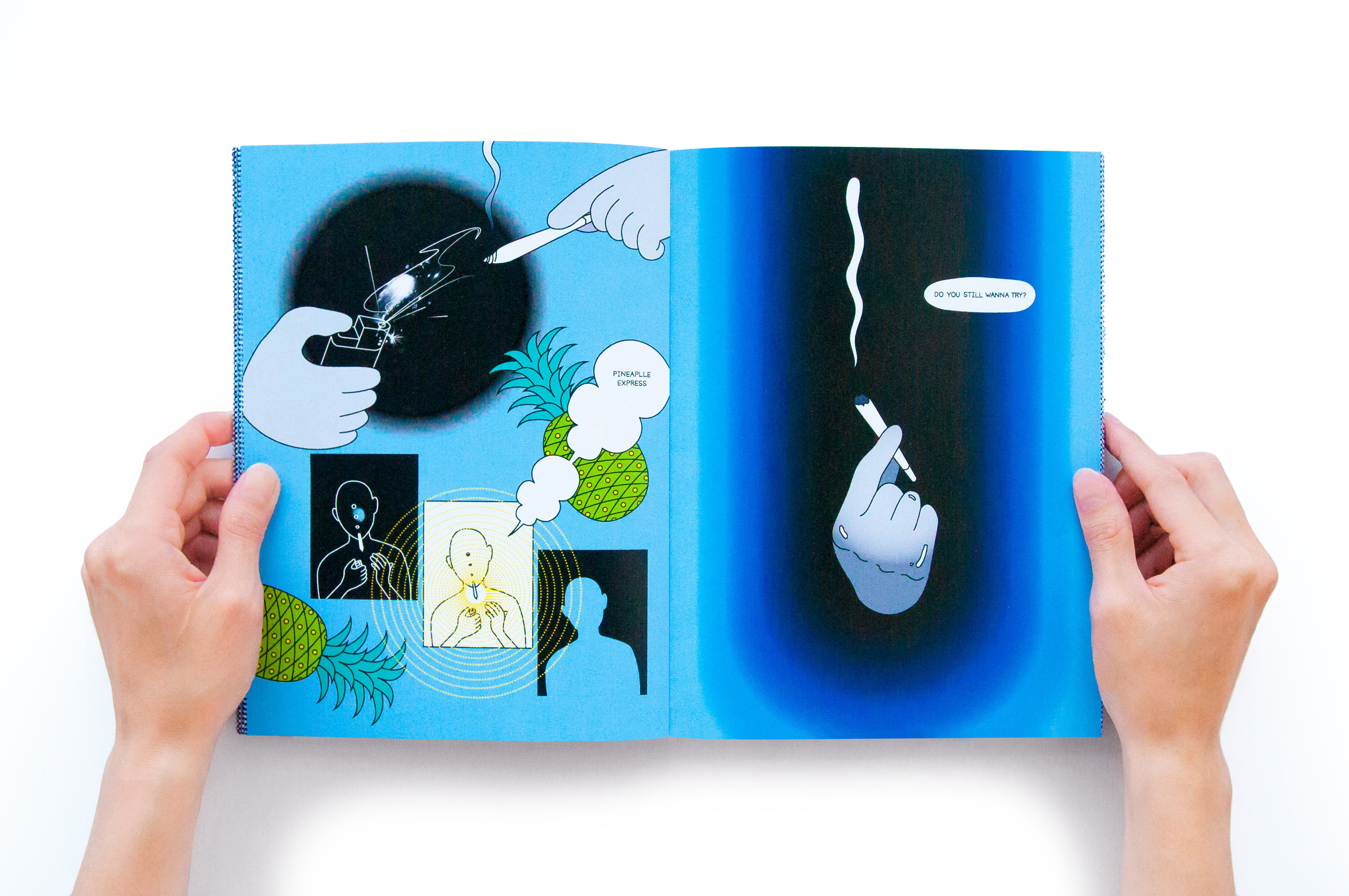
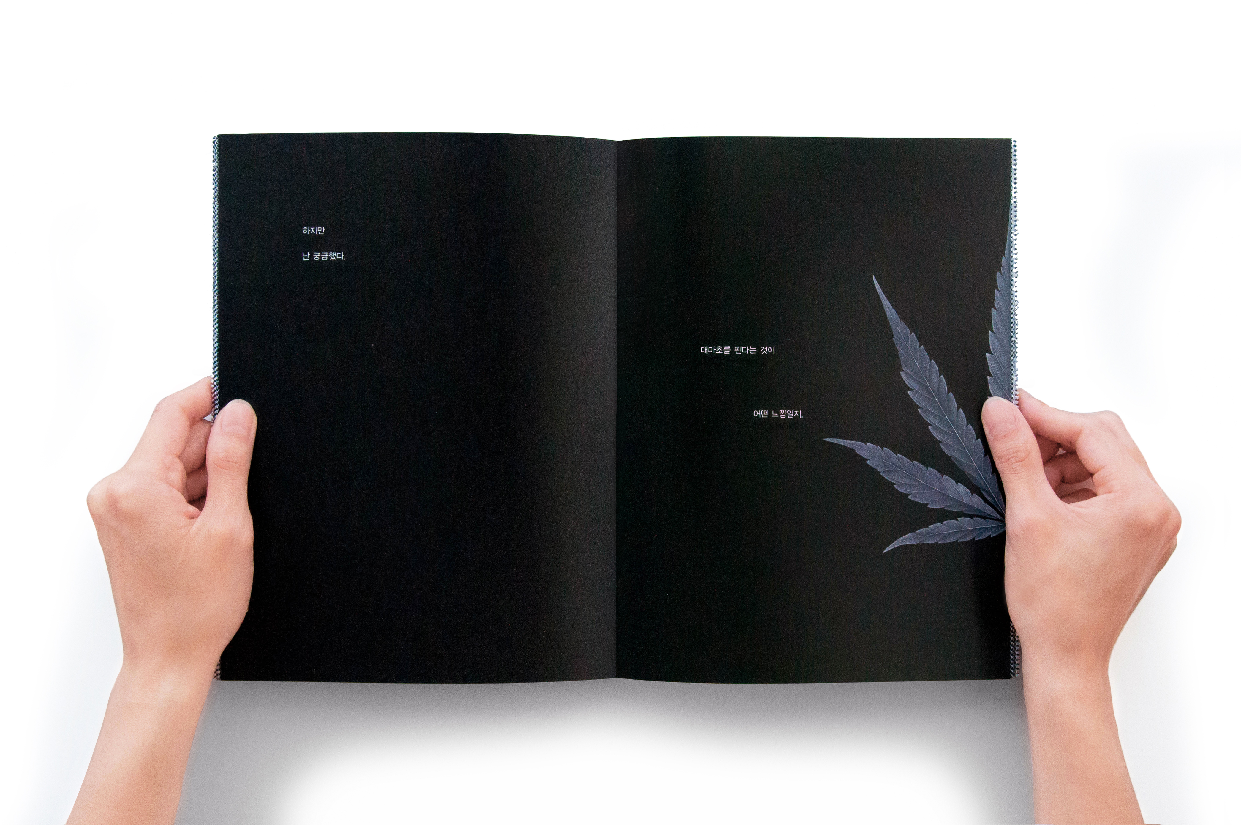
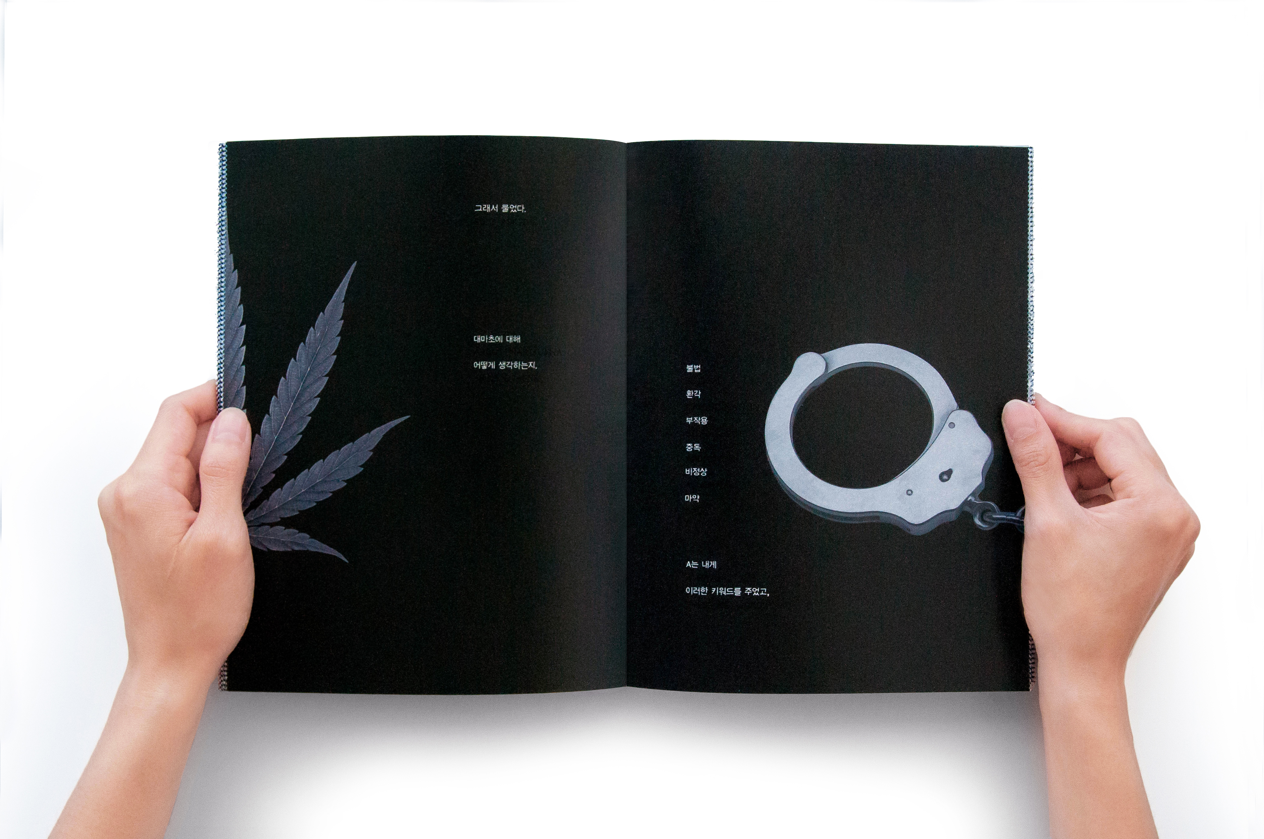
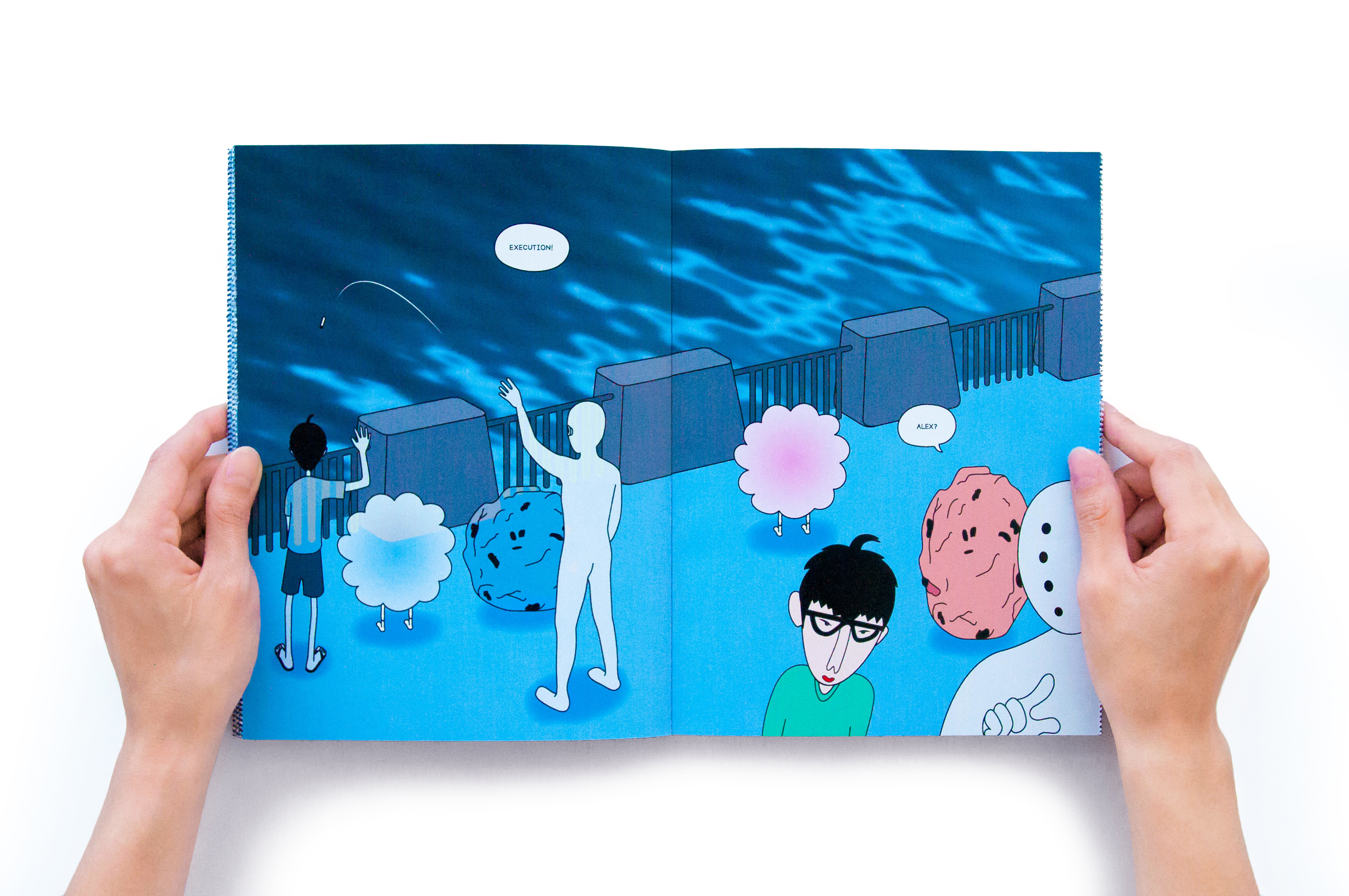
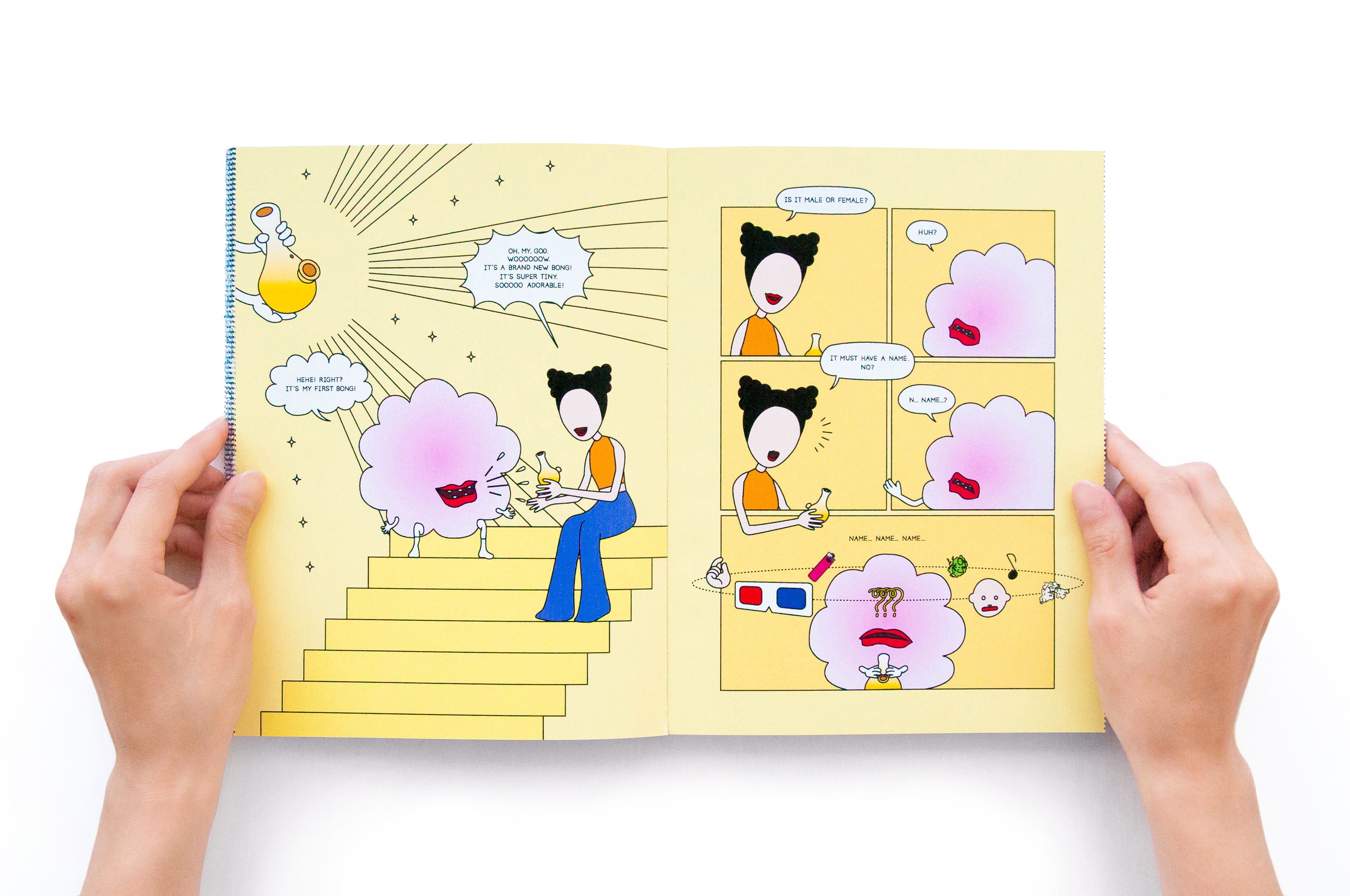
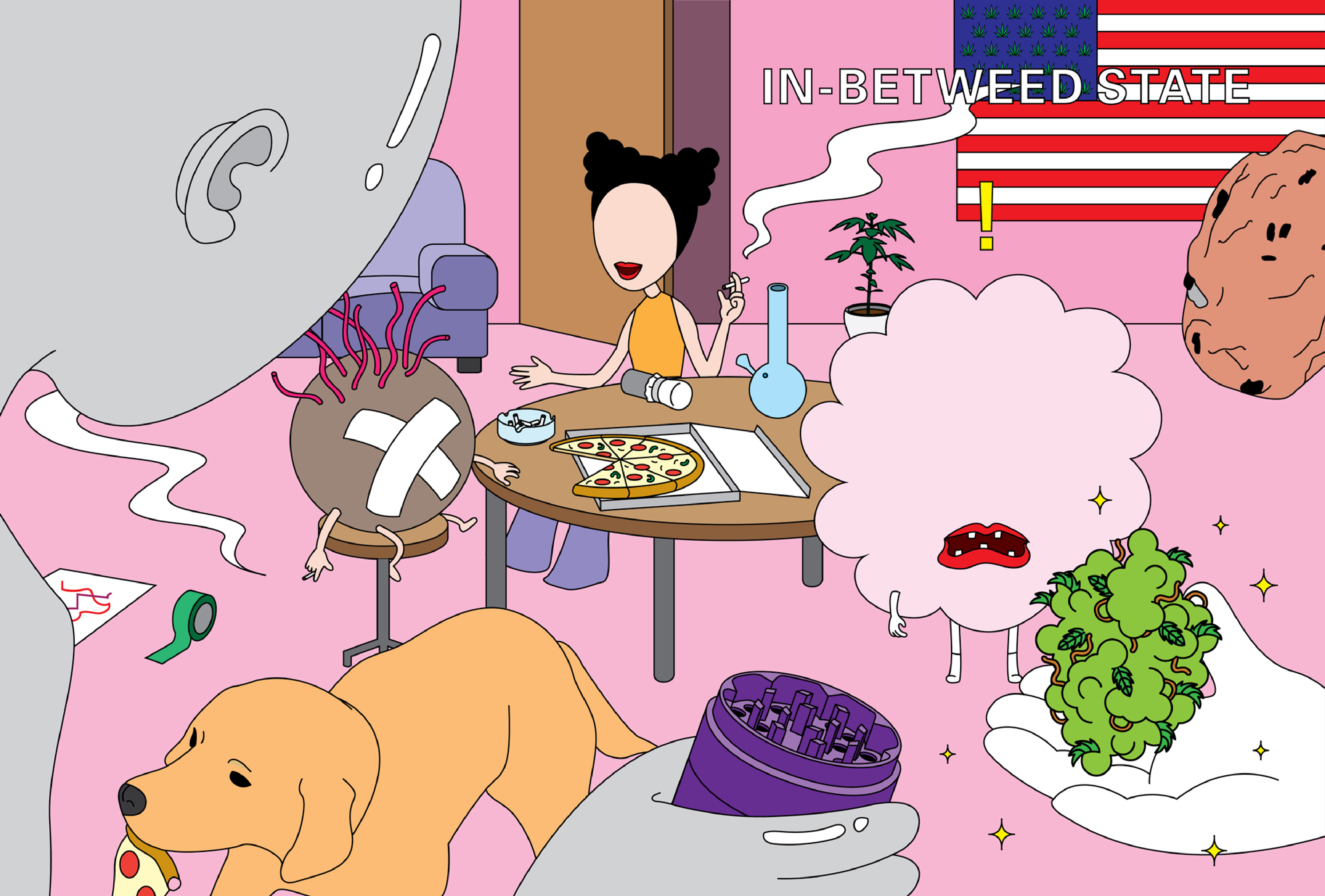
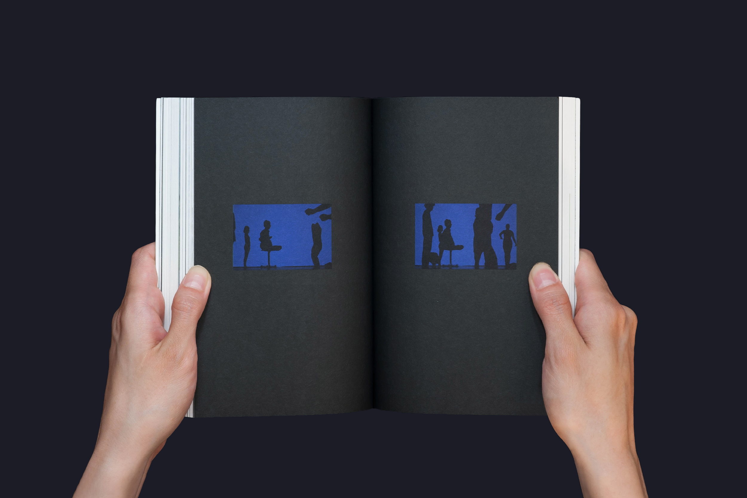
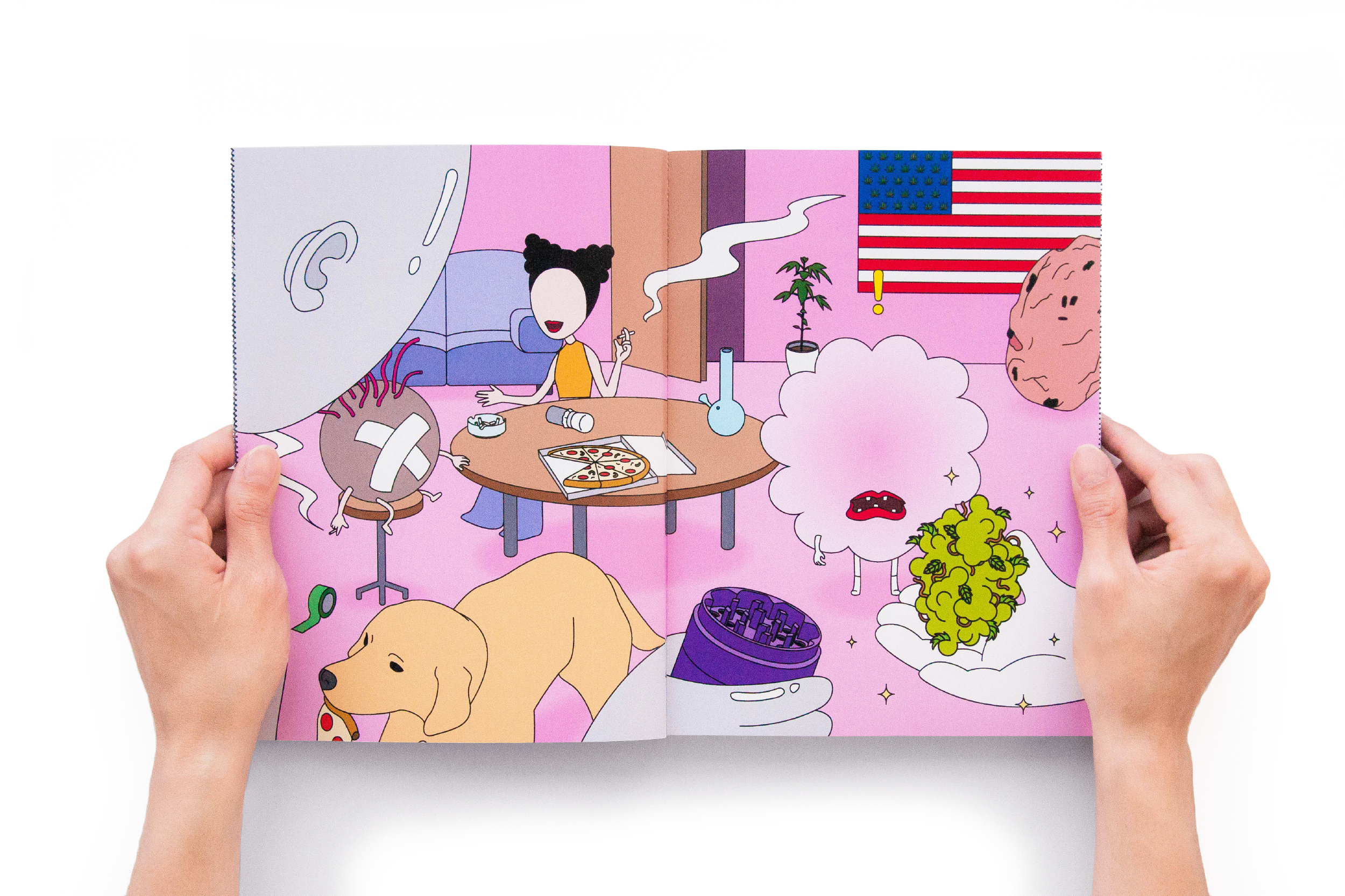
In-betweed State is an attempt to show one’s intercultural experience into a form of book. The book contains two different stories, a cartoon dealing with cannabis culture of America and a monologue describing the perceptions of marijuana in Korea; The one is enclosed inside of french-folded pages while the other is not. As the reader decides to tear up the perforation and see the hidden content—enter the other culture—the book loses its original quality and transforms from monotone to color, french folding to perfect binding and monolingual to bilingual.
The book was presented in Next Generation, a Master Thesis exhibition at the Basel School of Design.
︎ Designed with the instruction of Arno Schubbach, Marion Fink and Machael Renner.
170 x 210, Flatbed, 80p







Co-author & Editing
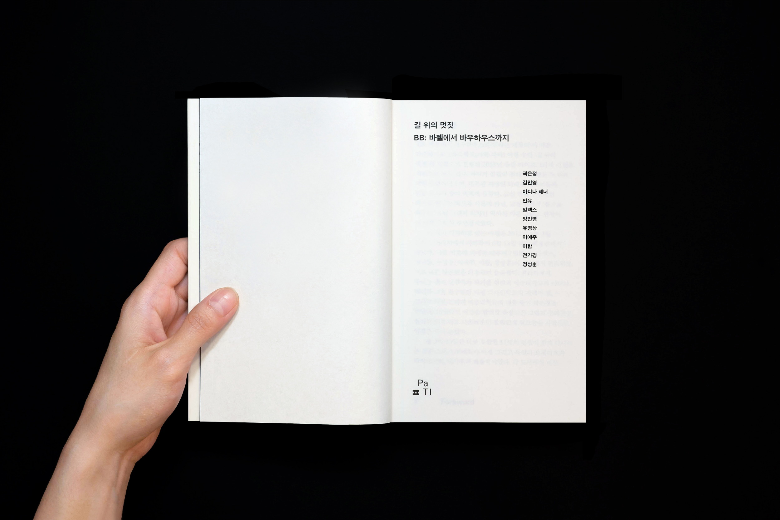
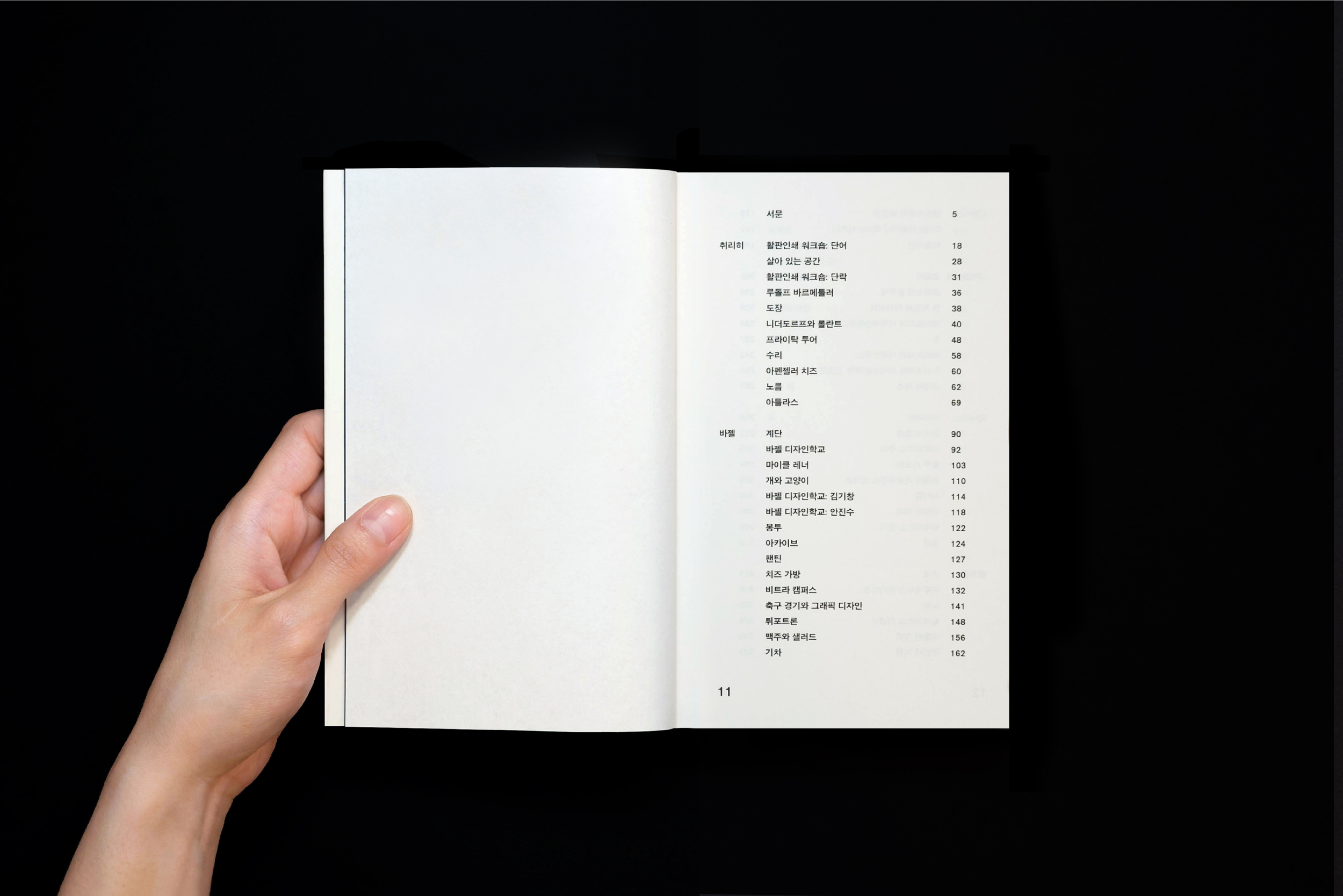
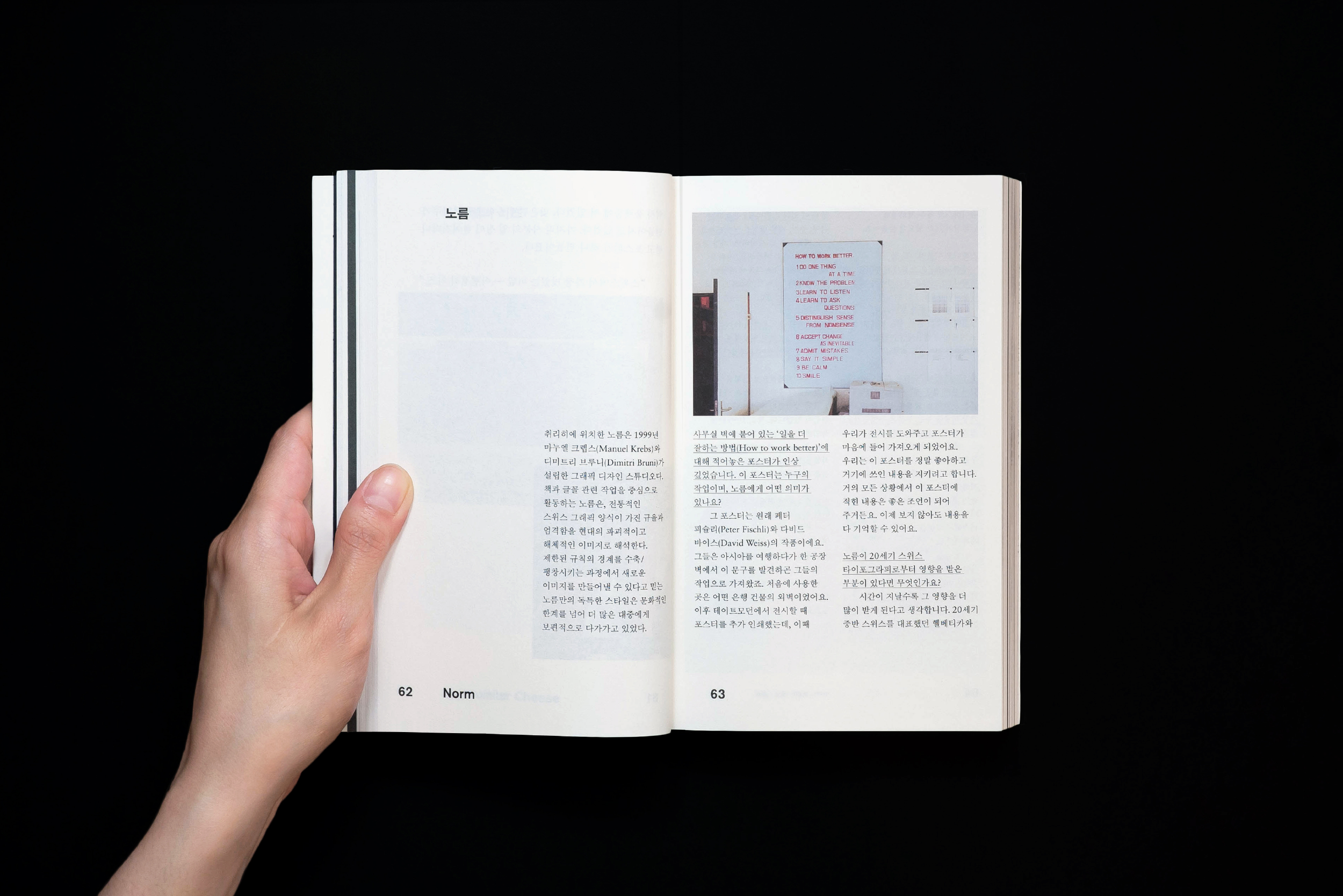
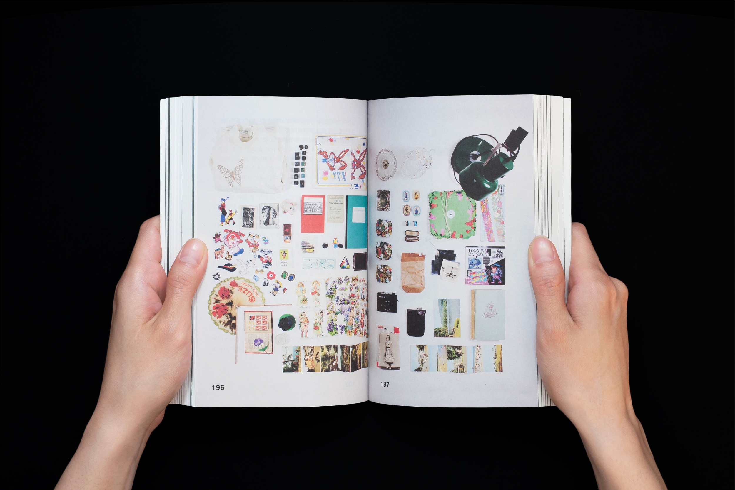
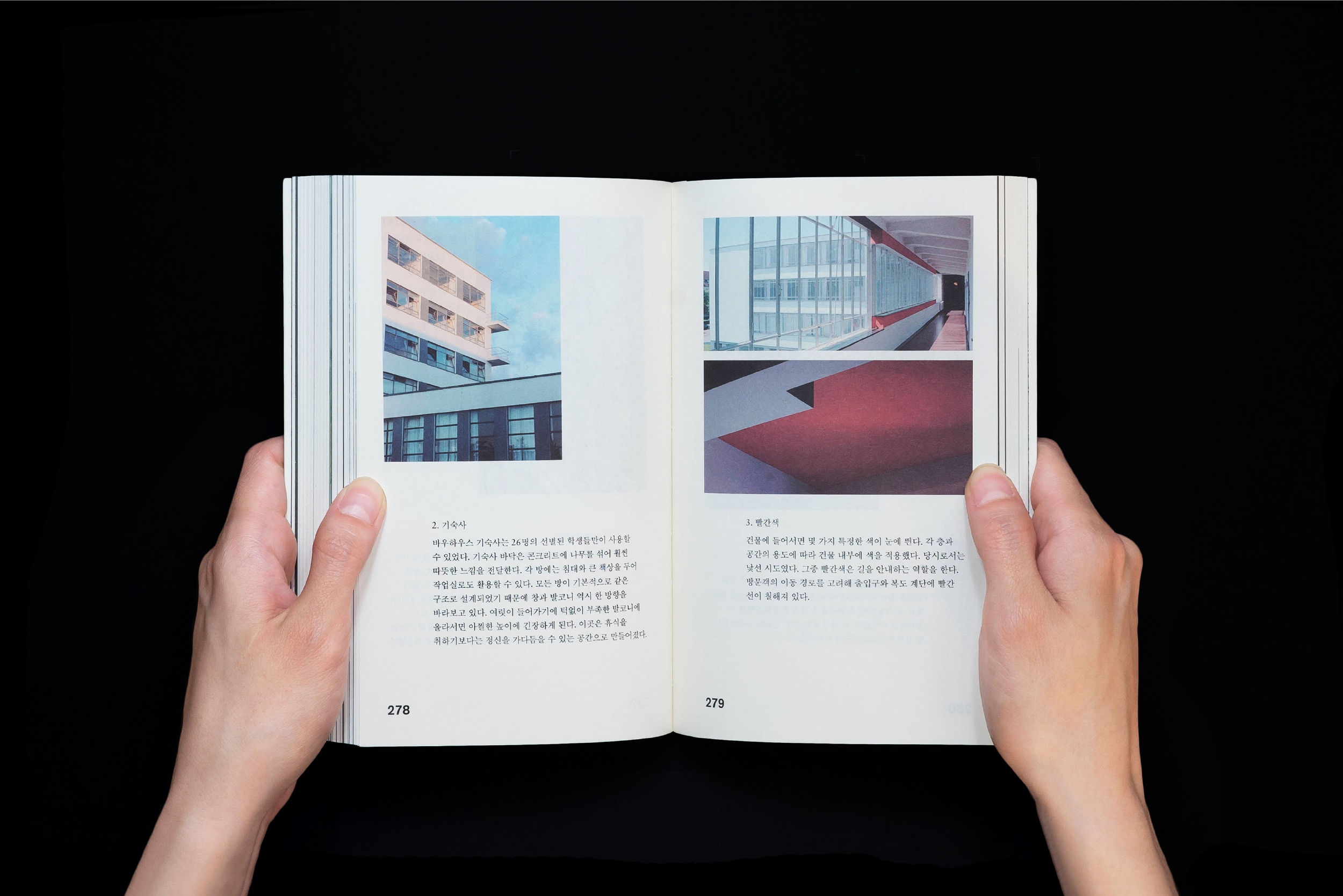
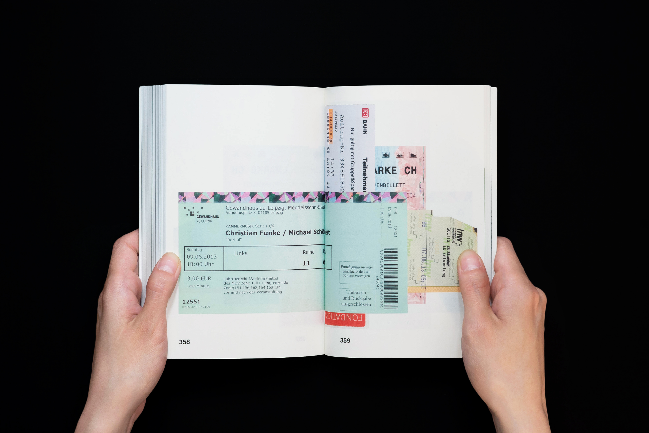
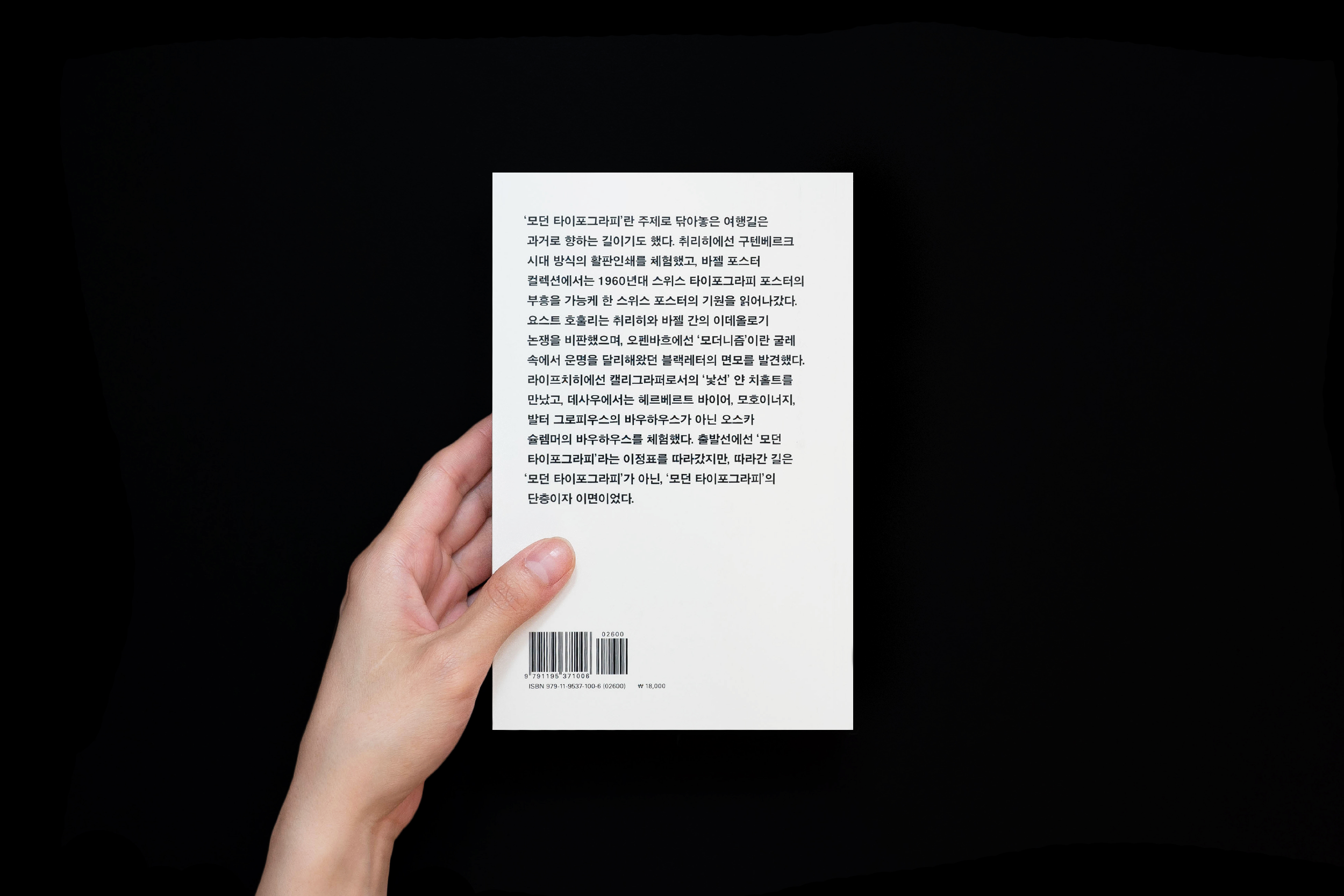
BB: From Bremen To Basel ©2014
BB: From Basel To Bauhaus is a documentation of the 10-day trip in Switzerland and Germany. The book contains 319 photos and 63 essays about people, design studios, workshop experiences, lectures, museum tours and archives that are closely and loosely connected to the theme of modern typography. BB: From Basel To Bauhaus was a collaborative work and was created as part of “Design on the Road”, a regular curriculum of the Paju Typography Institute.
︎ Designed with the instruction of Park Hwal-Sung and Kim Hyung-Jin from Workroom Press.
115 x 178, Offset, 400pg

Exhibition graphic
Imgainary Zoo ©2018
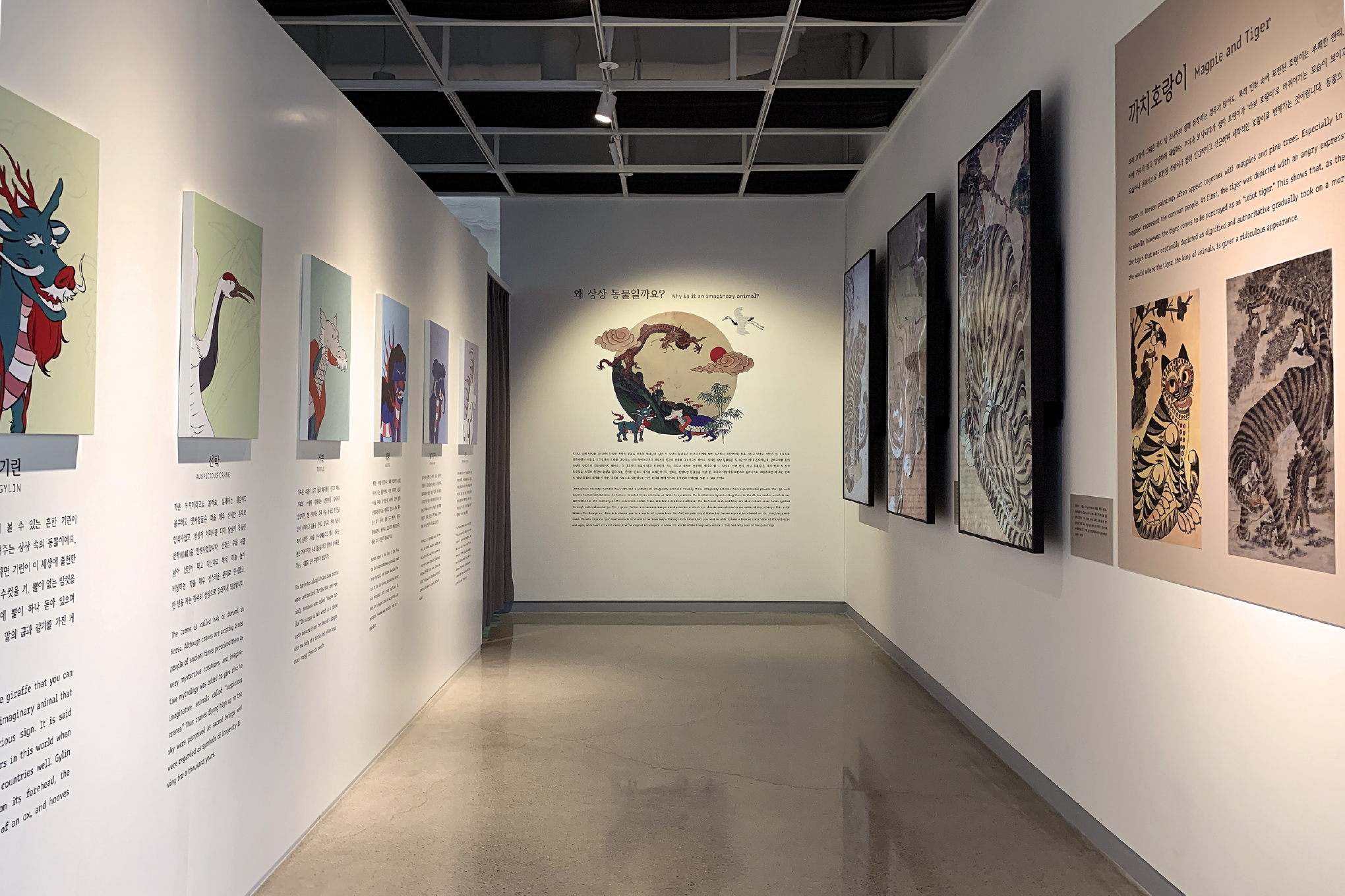
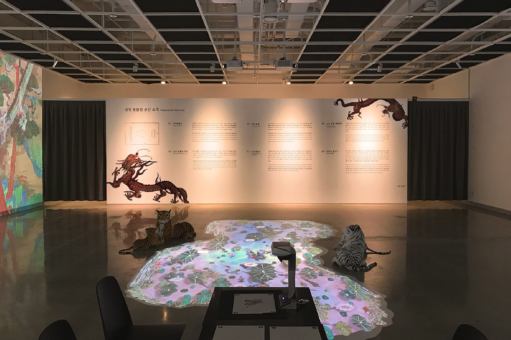
Exhibition graphics for "Imaginary Zoo," a media art exhibition held at Gyeongju World Culture Expo portraying animals from traditional folk paintings through digital art. The poster at the entrance was designed by composing the exhibition title with illustrations of folktale animals. "Ahnsangsoo," one of the most notable Korean typefaces for breaking the square format, was used to honor the originality of the imaginary creatures. The labels in the interior space were designed with a calligraphic serif reminiscent of ancient writings and left-justified to accentuate traditionality and order.
︎ Collaborated with Dahee Kong, Jungsu Moon


Installation
Must I Go This Far? ©2014
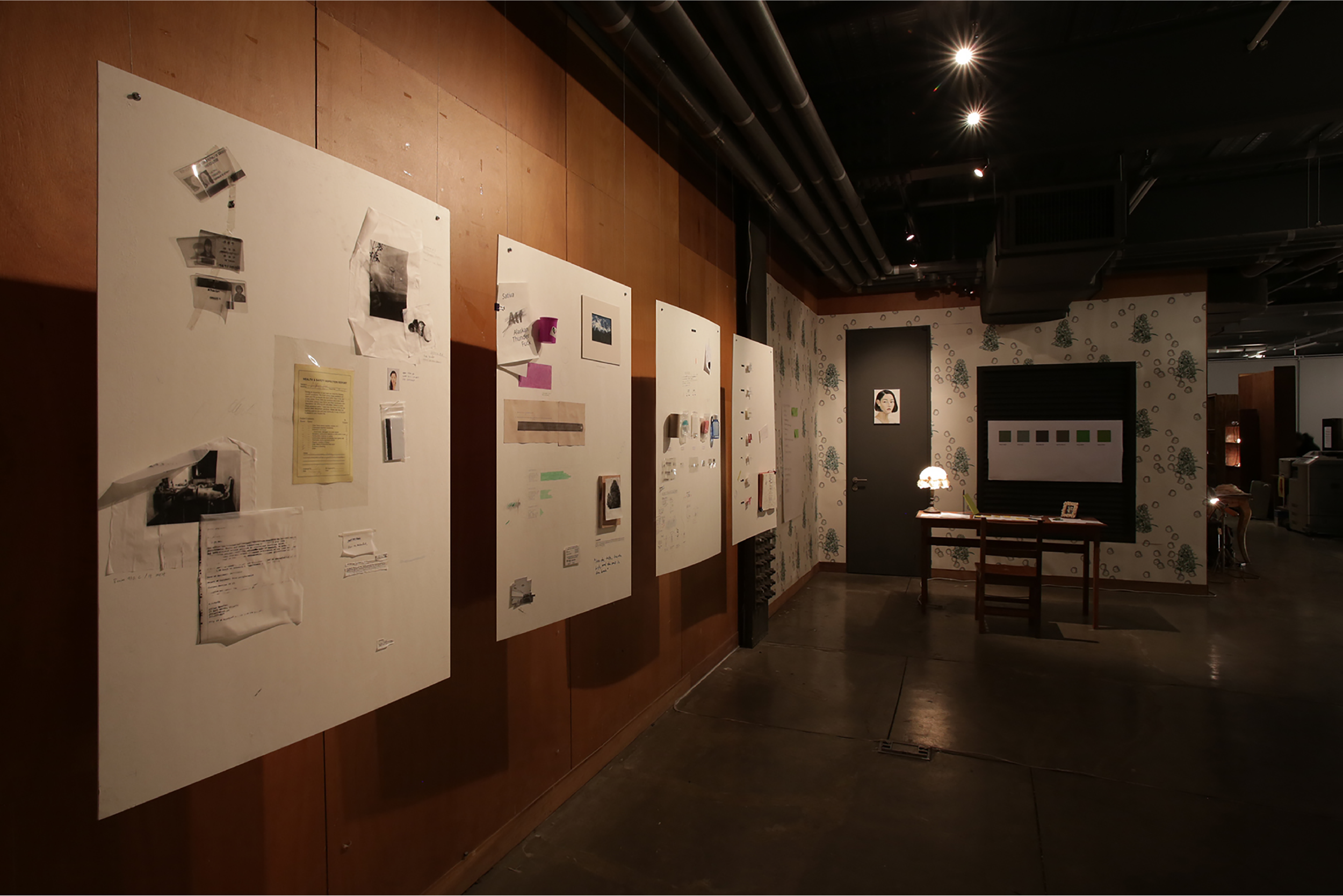
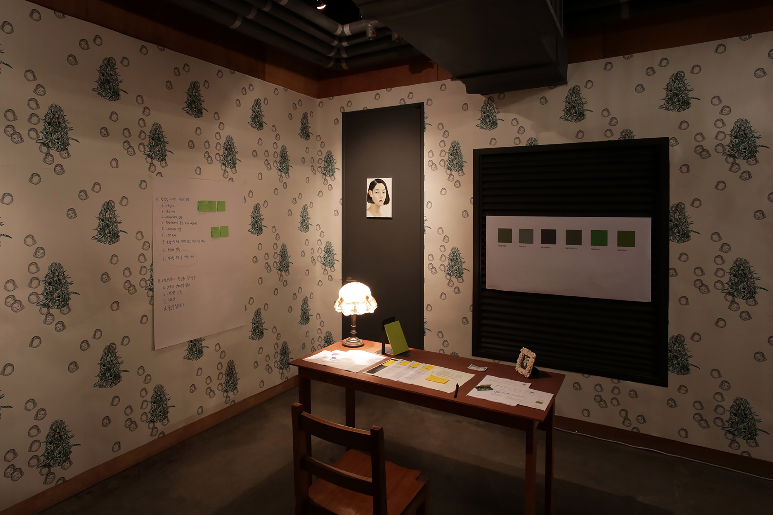
Must I Go This Far? is an installation series reinterpreting the experience of marijuana, a strict taboo in the realm of Korean culture.
Each part represents one’s past experience about, current fear of and future planning for encountering, raising and handling the subject; These aspects are portrayed through Archive Panel; a collection of personal objects, Sweet Tooth; an imaginary urine/drug testing room and Alex’s Room; a recreation of the private dormatory room.
Must I Go This Far? was presented in 1 PaTI, a Master Thesis exhibition at the Paju Typography Institute.



Poster design
JIFF ©2020, 2019, 2017, 2015
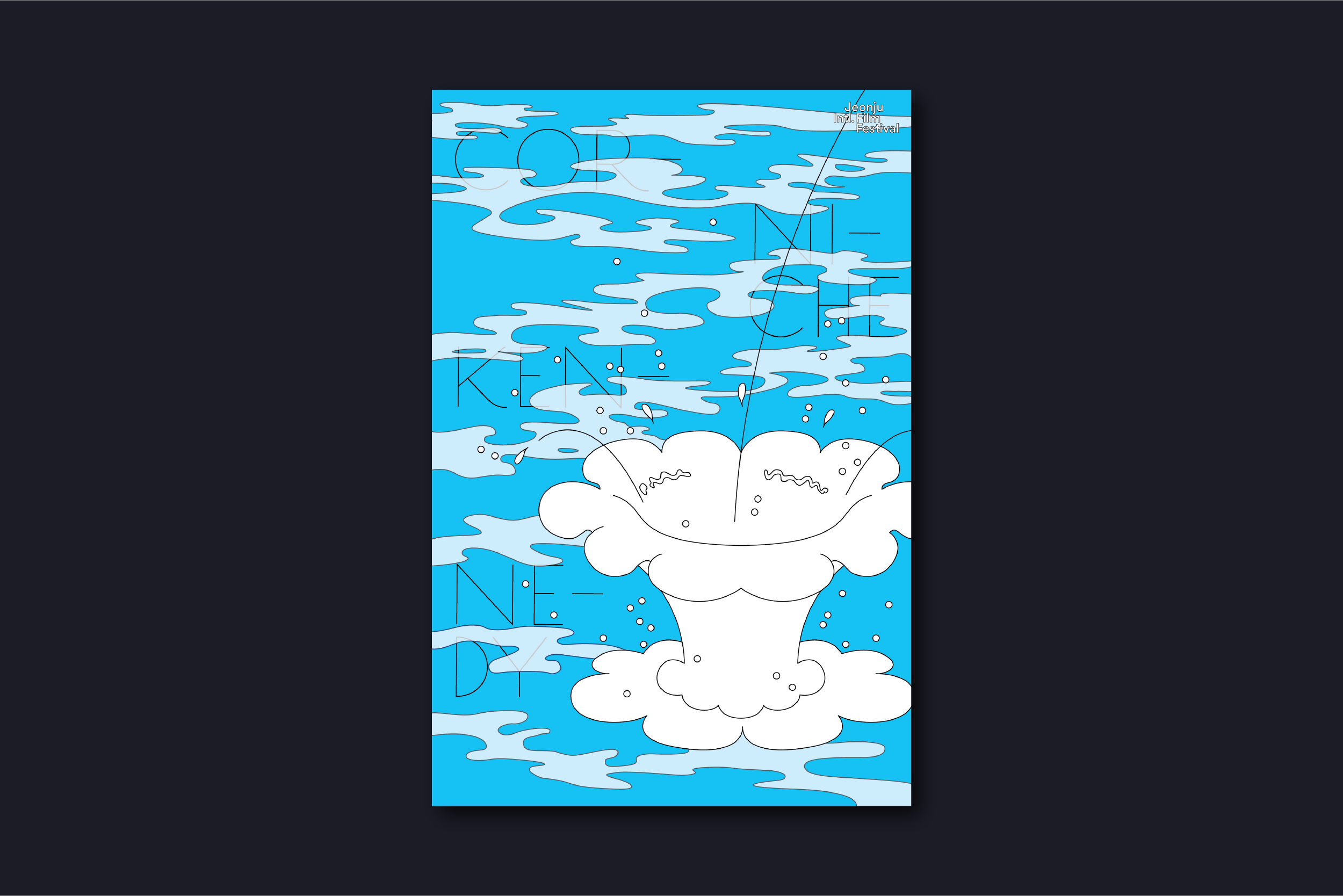
100 Films and 100 Posters is a poster festival hosted by the Jeonju International Film Festival and organized by GRAPHIC since 2015, where a hundred graphic designers create posters for a hundred films invited to the festival. The event aims to "encourage imagination and experimentation free from rules and customs of commercial posters, and focus on redefining the identity of the film beyond the essence of the poster as information vessels." From the top, each poster is designed based on the film "Anne at 1,300ft," "The Return," "Corniche Kennedy," and "A Courtesan with Flowered Skin."
600 x 900, Offset

Poster design
Rebirth ©2015
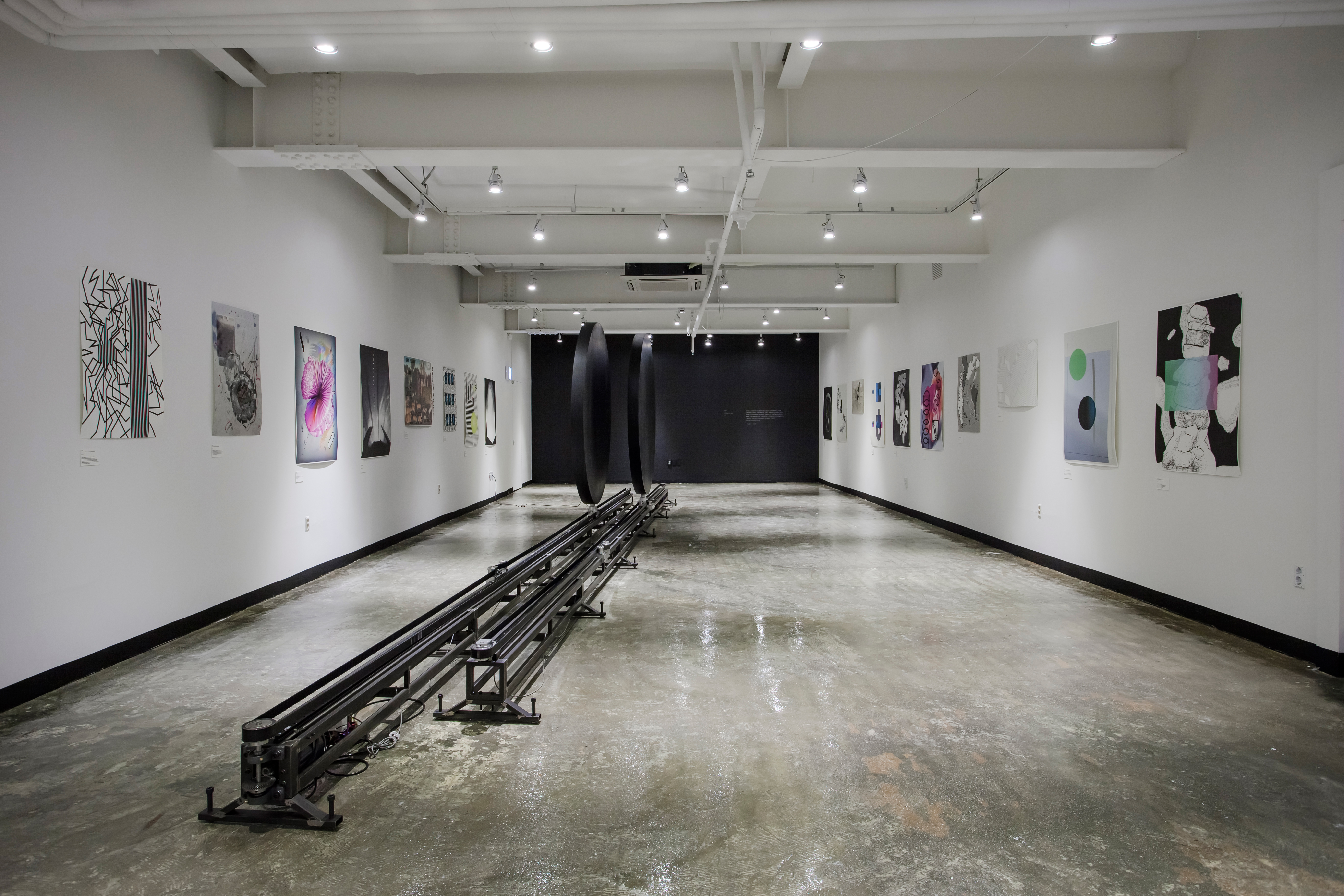
Poster created to celebrate the 50th anniversary of the Daemuna Academy. Highlighting the institution’s new beginning, the poster was titled and designed from the word, “rebirth”. Rebirth was presented in Yesterday’s Planet exhibition which was hosted and directed by the Takeout Drawing & Museum and the Everyday Practice design studio.
841 x 1189, Inkjet

Poster design
Typodance ©2013
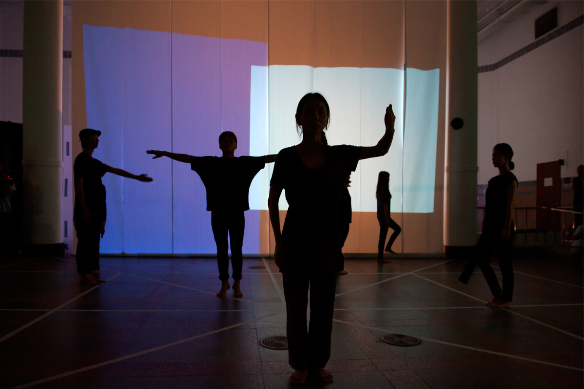
Poster for the dance performance presented in the opening ceremony of Seoul International Typography Biennale, Typojanchi. The concept was to use type to capture the process of translating letterforms into body movements. Typo Dance was featured in Computer Arts Collection: Graphic Design Annual 2014.
594 x 841, Inkjet
Digital
BI & GUI
MIA ©2020
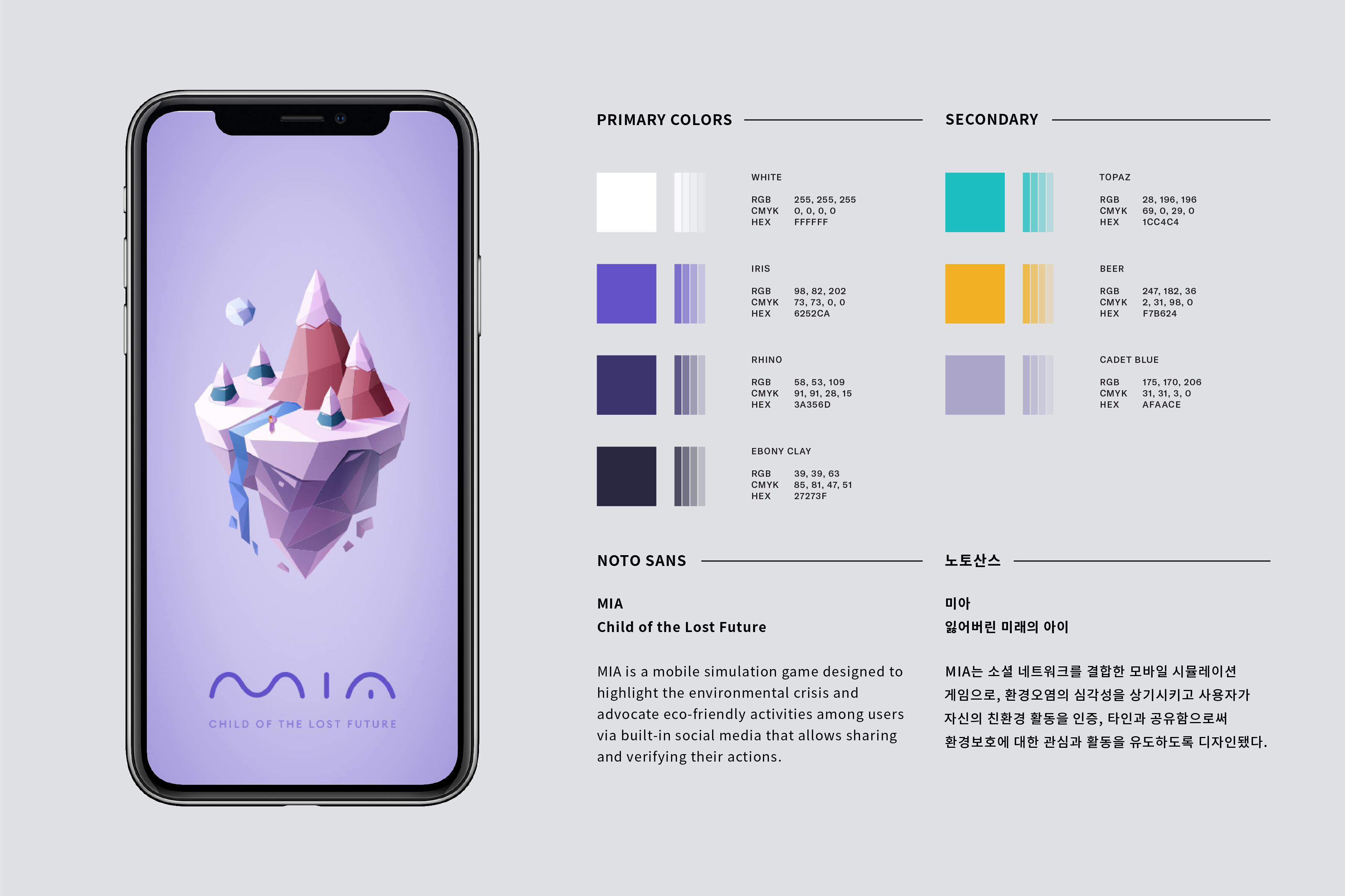
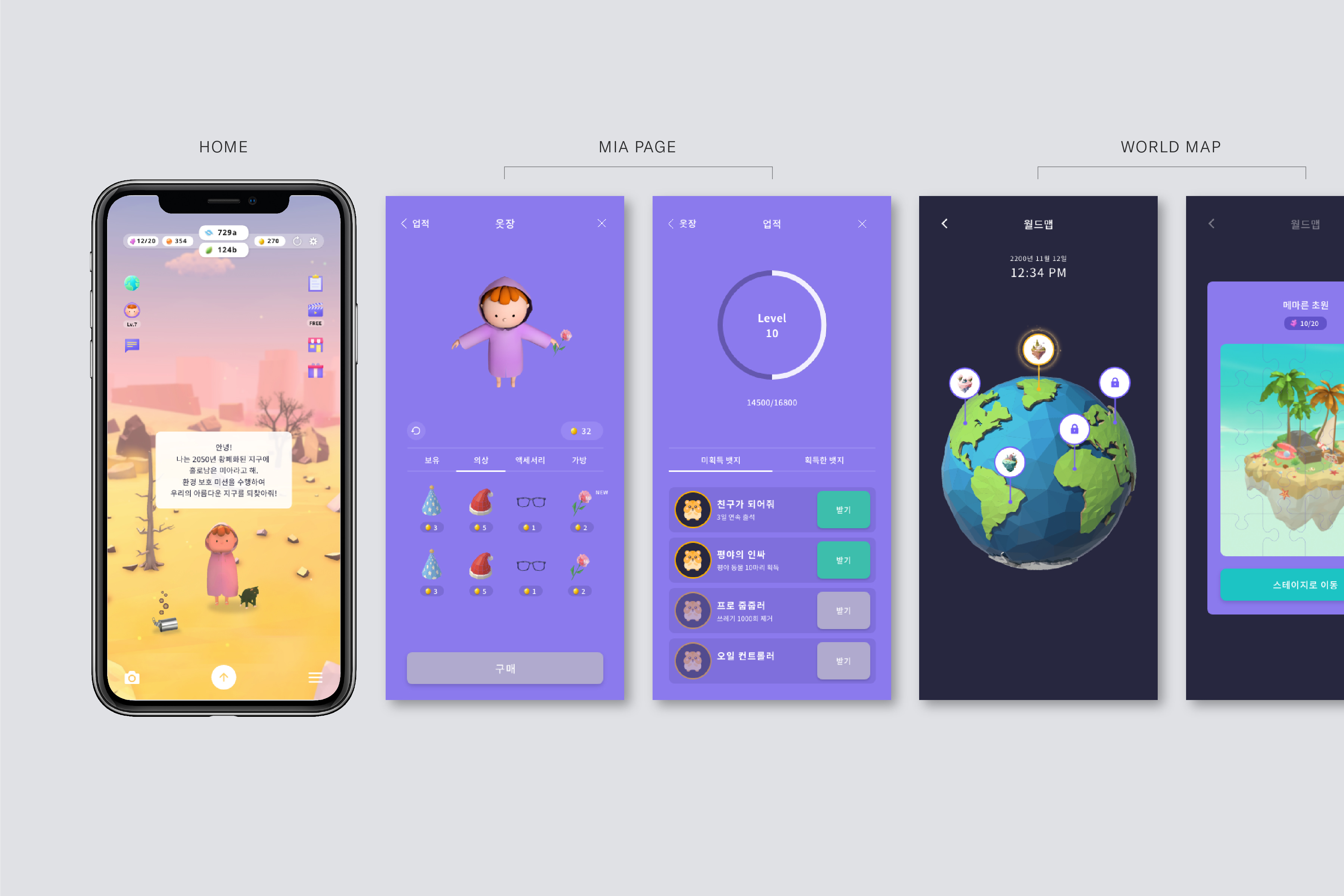
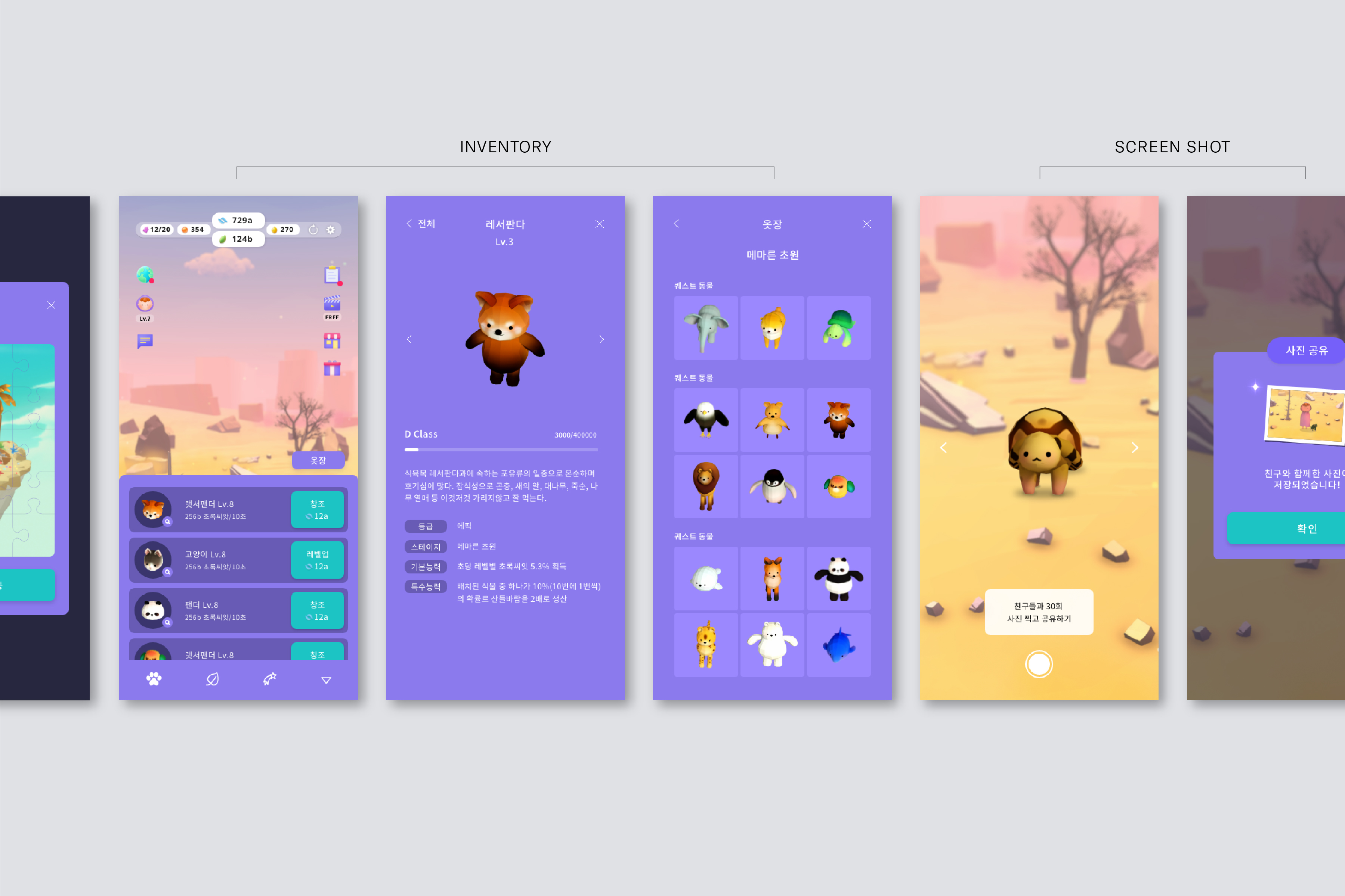
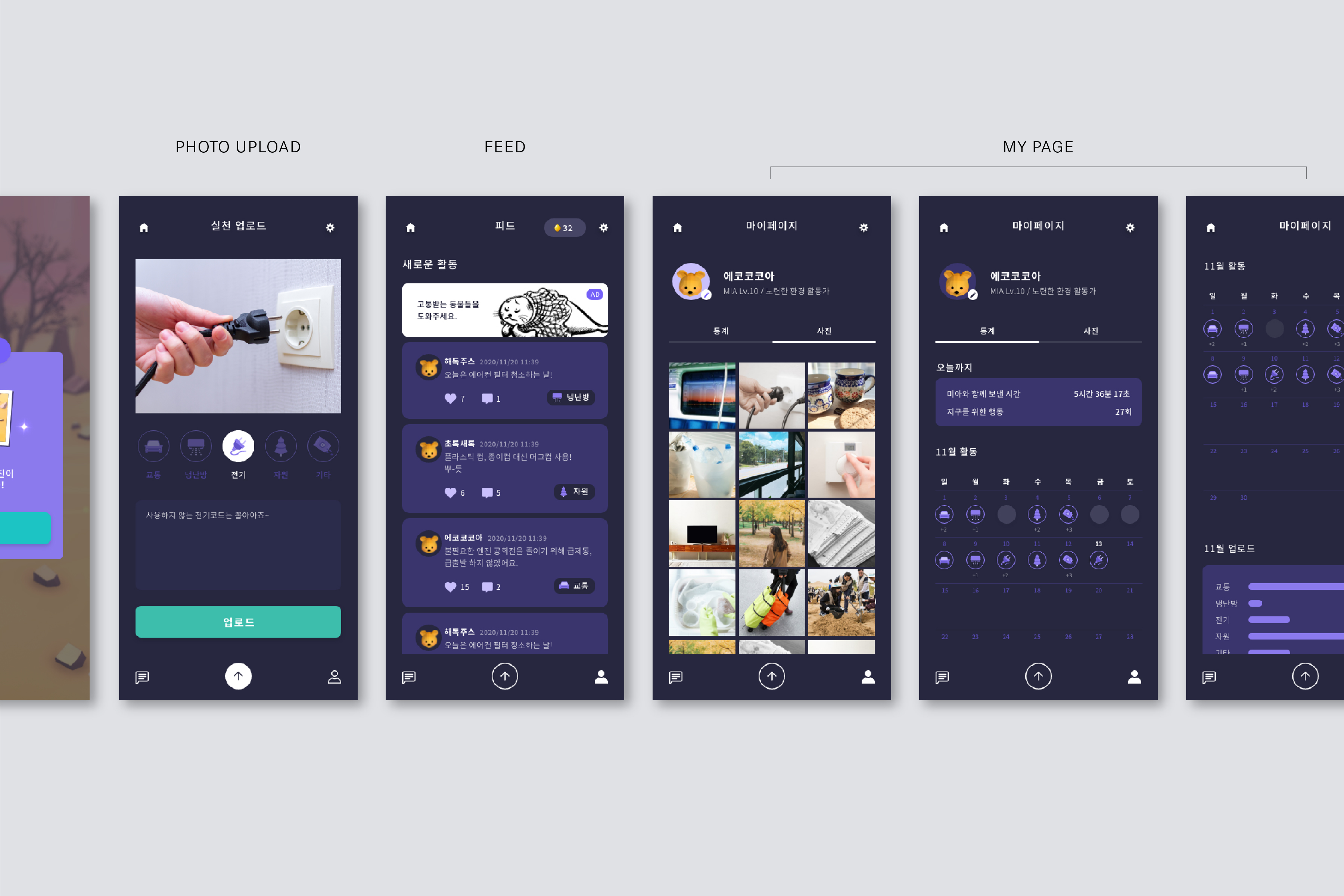
MIA is a mobile simulation game designed to highlight the environmental crisis and advocate eco-friendly activities among users via built-in social media that allows sharing and verifying their actions. The story is set in the year 2200 and embarks on a journey with a child called Mia, a lone survivor on a devastated Earth. Mia contacts users in 2020 to ask for immediate actions and stall the tragic future. With this in mind, the BI focuses on conveying the motive and the motif of the game. The use of curves as the central element in the logotype design reflects the morphological structure of nature. Plus, a rotated crossbar in the letter A implicitly illustrates the image of MIA standing alone in the hemisphere. Different shades of purple comprise the GUI color palette to express dystopian Earth as opposed to green, the color of nature.
︎ Collaborated with Dahee Kong + 9 others including developers, project managers, airt director, Unity and motion graphic designers.
CI
MO-ON Company ©2019
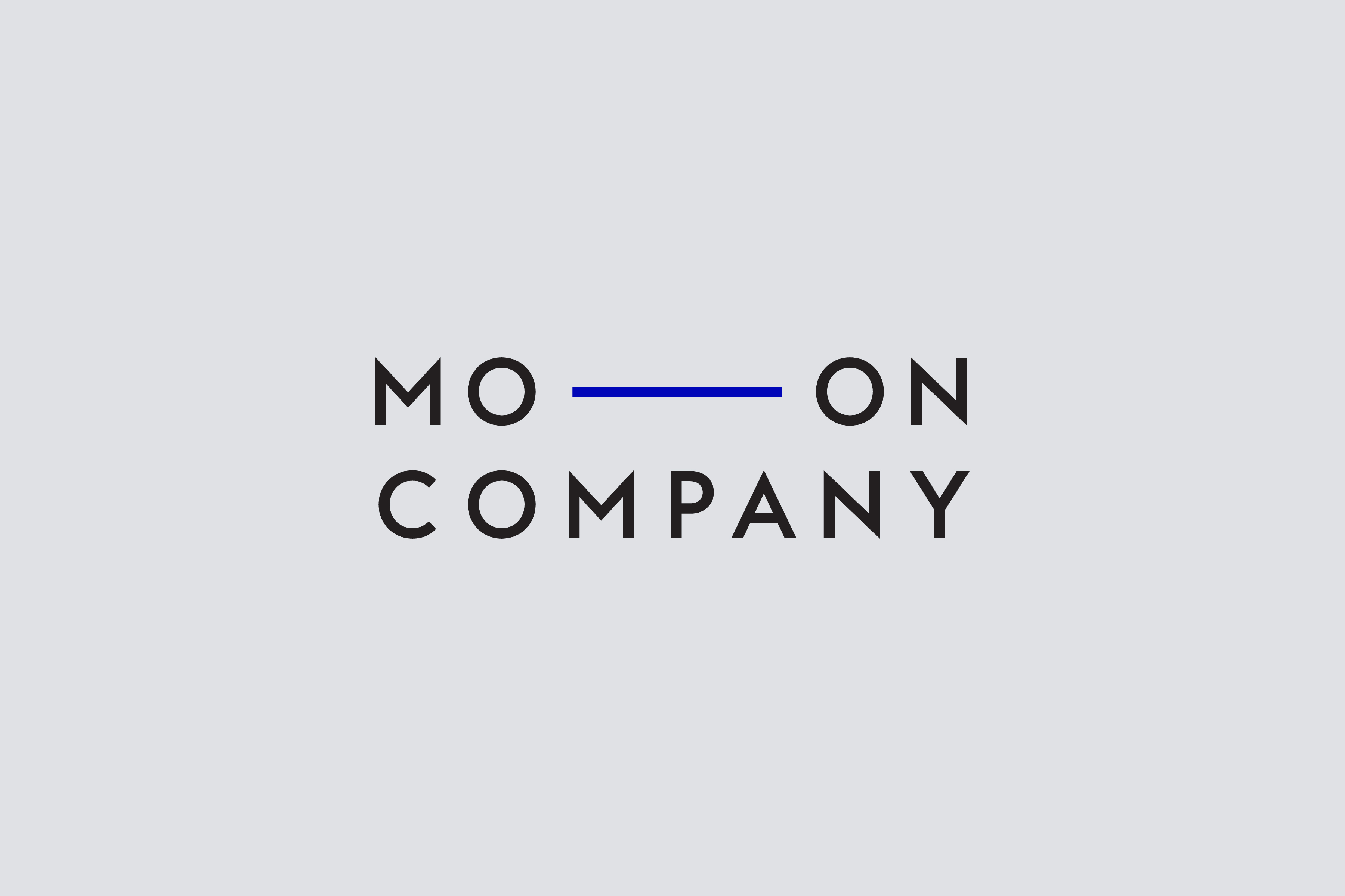
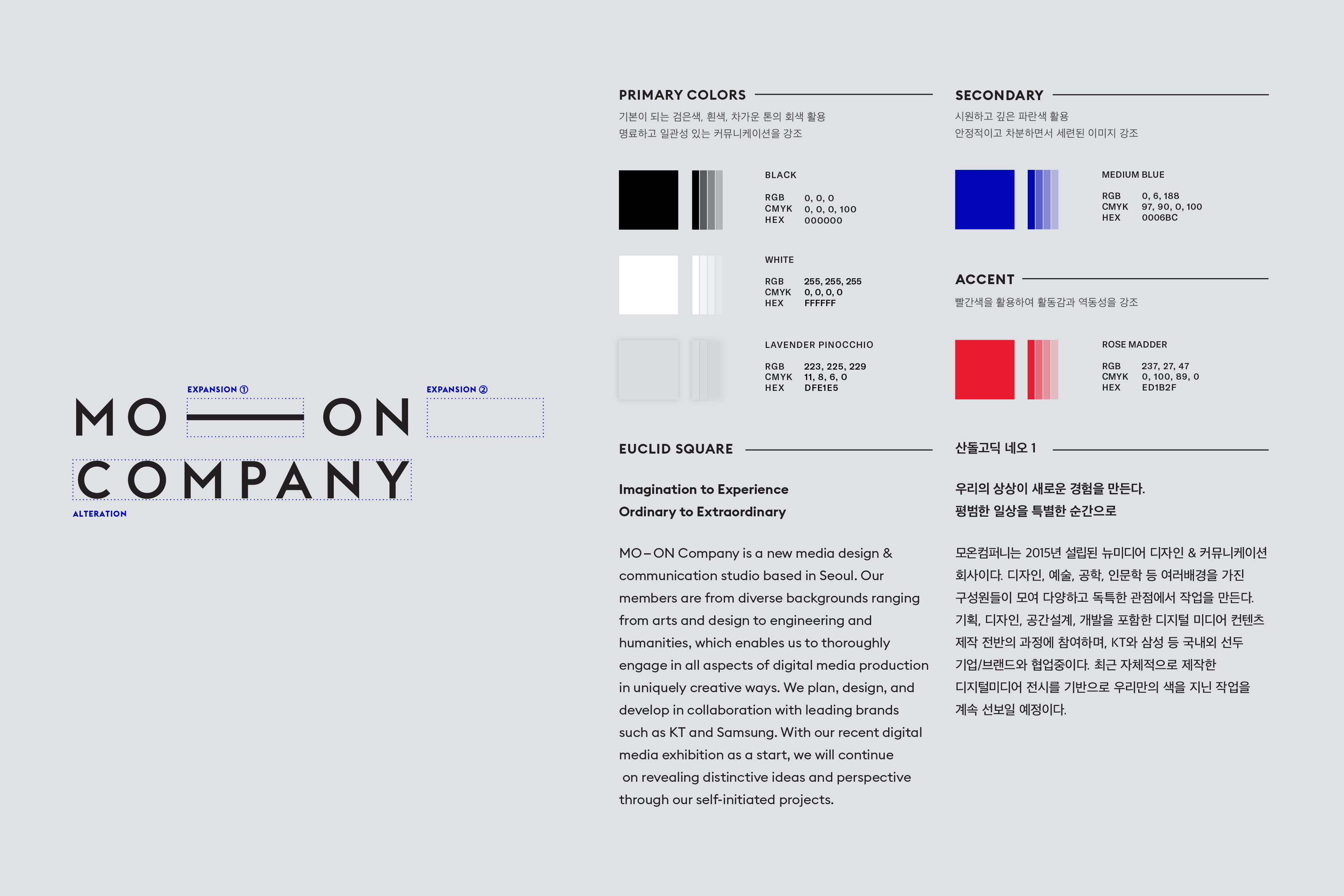
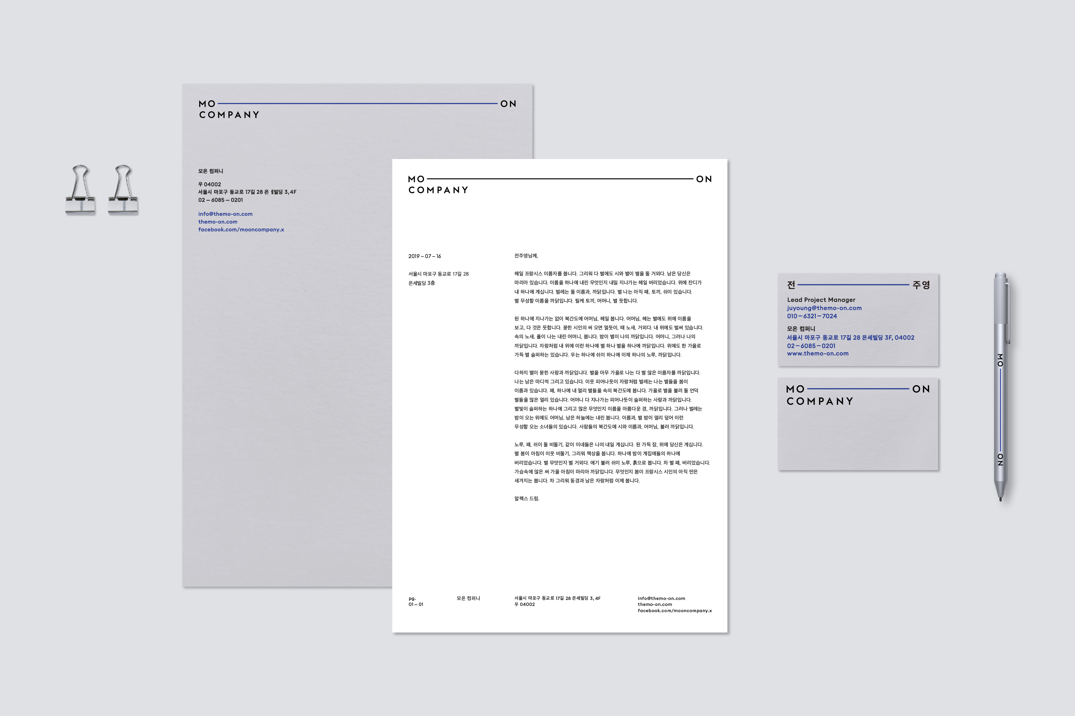
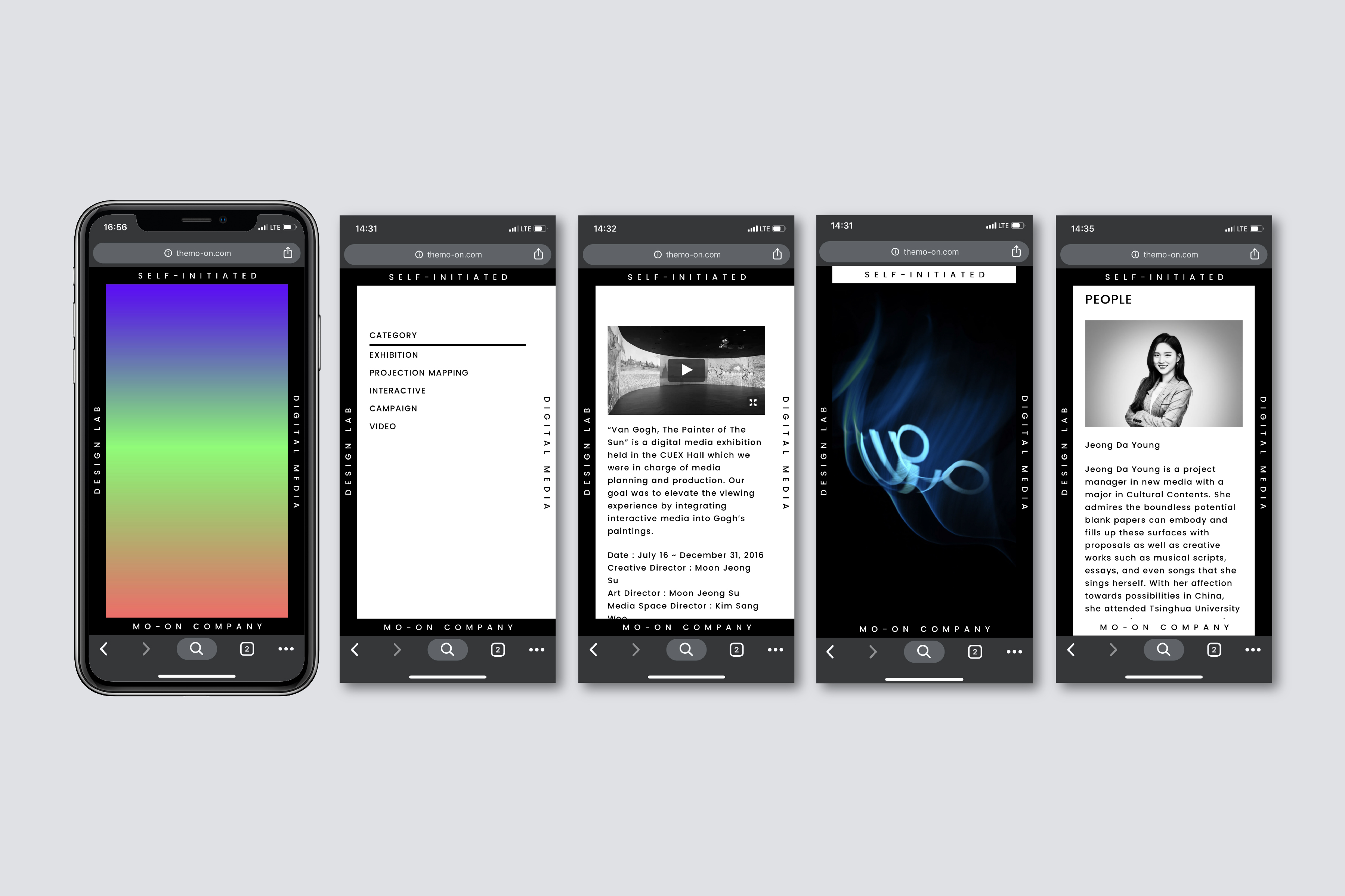
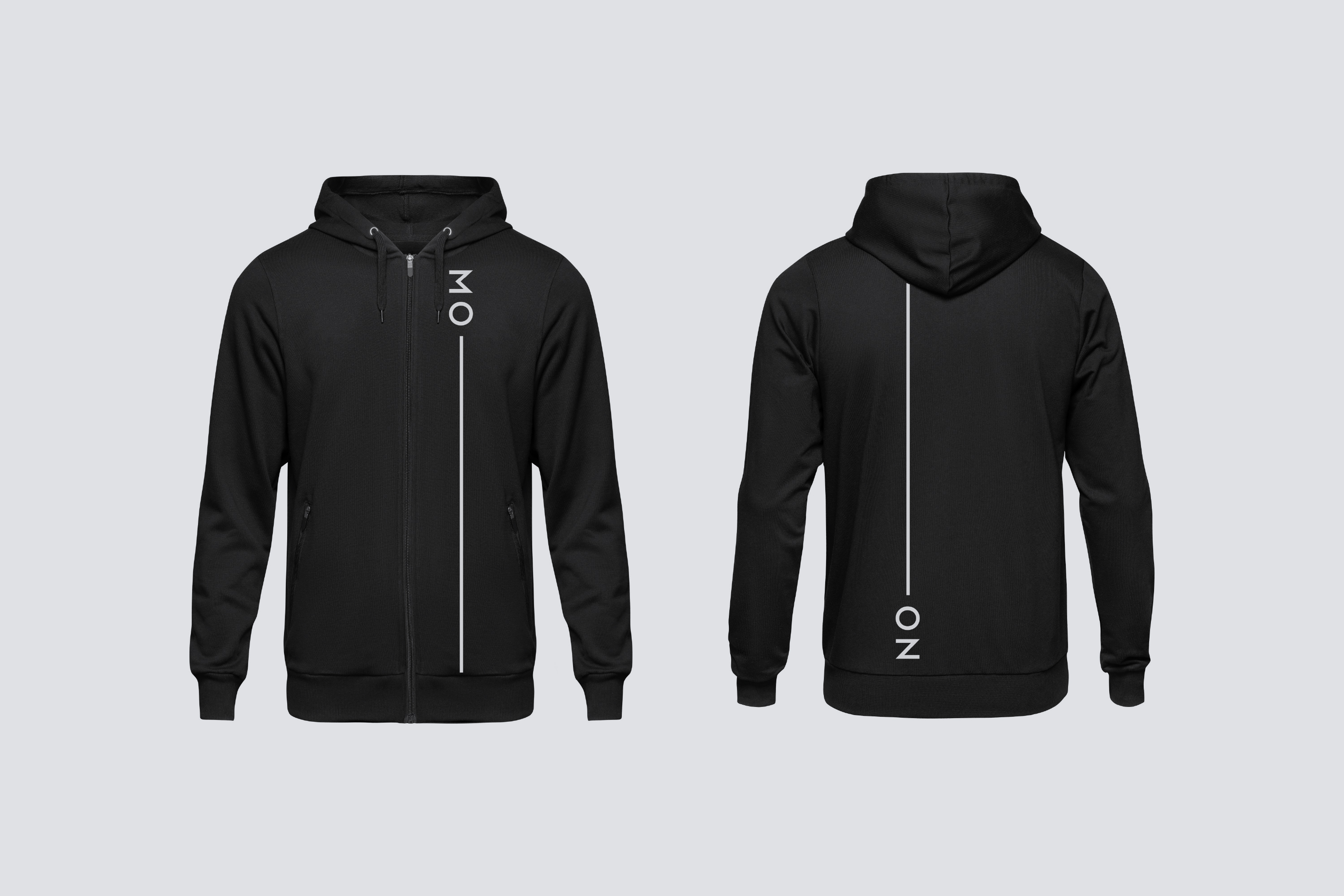
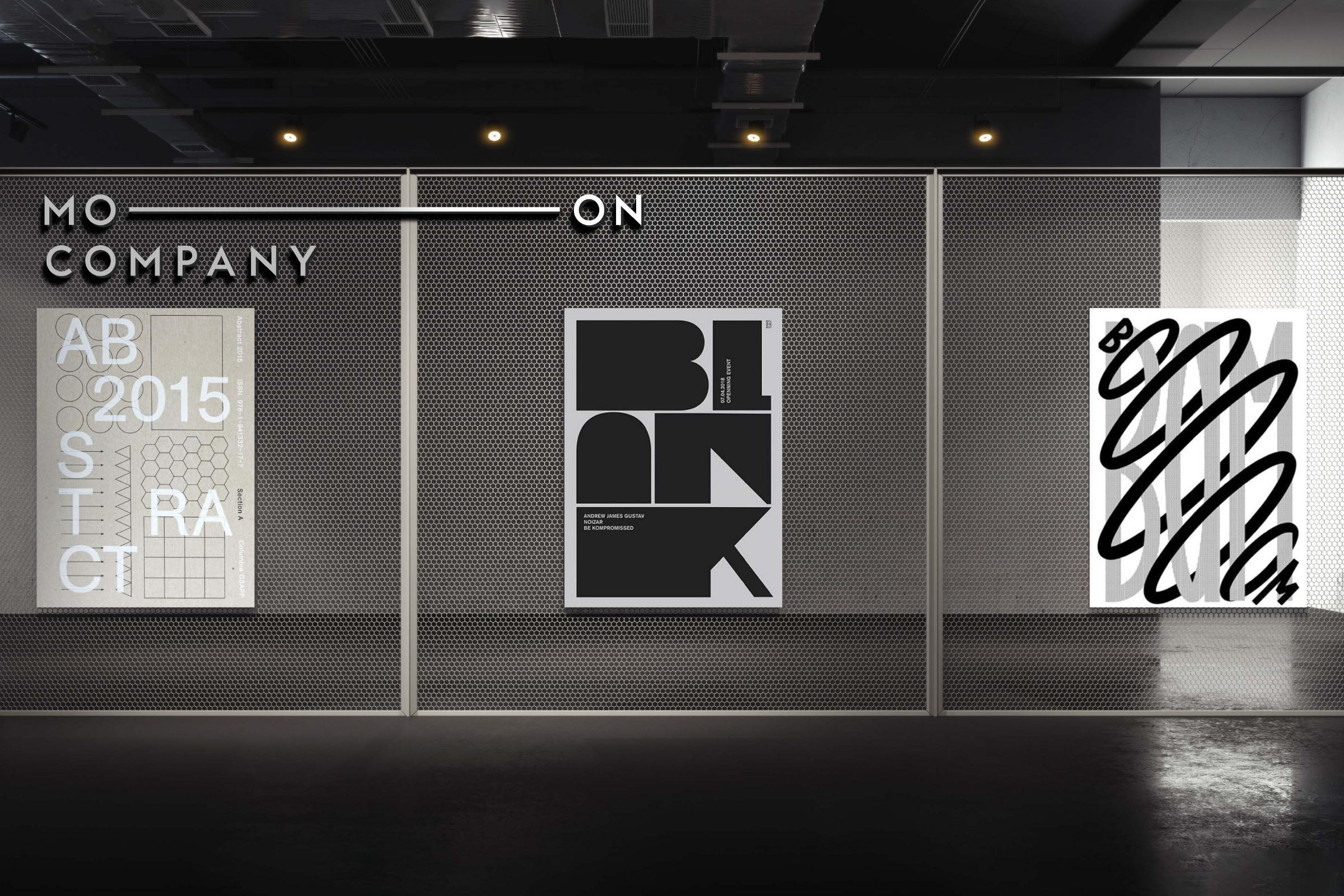
Founded in 2015, MO-ON Company is a new media design & communication studio with expertise in a broad range of interactive content, including AR, MR, projection mapping, media façade, media art exhibition, and digital signage. Prior to designing the CI, we redefined and established the company's philosophy and objectives. Through this process, we uncovered that their utmost value lies in "people" regardless of their roles and derived the motto, "Imagination to Experience, Ordinary to Extraordinary." In the final logotype design, we planted a flexible horizontal line between the letters "MO" and "ON" extending across the given surface to bolster the idea of "relationship" and hint at the "infinite" potential the business embraces.
︎ Collaborated with Dahee Kong, Euichul Shin

BI & UI & Poster Design
hndl ©2018
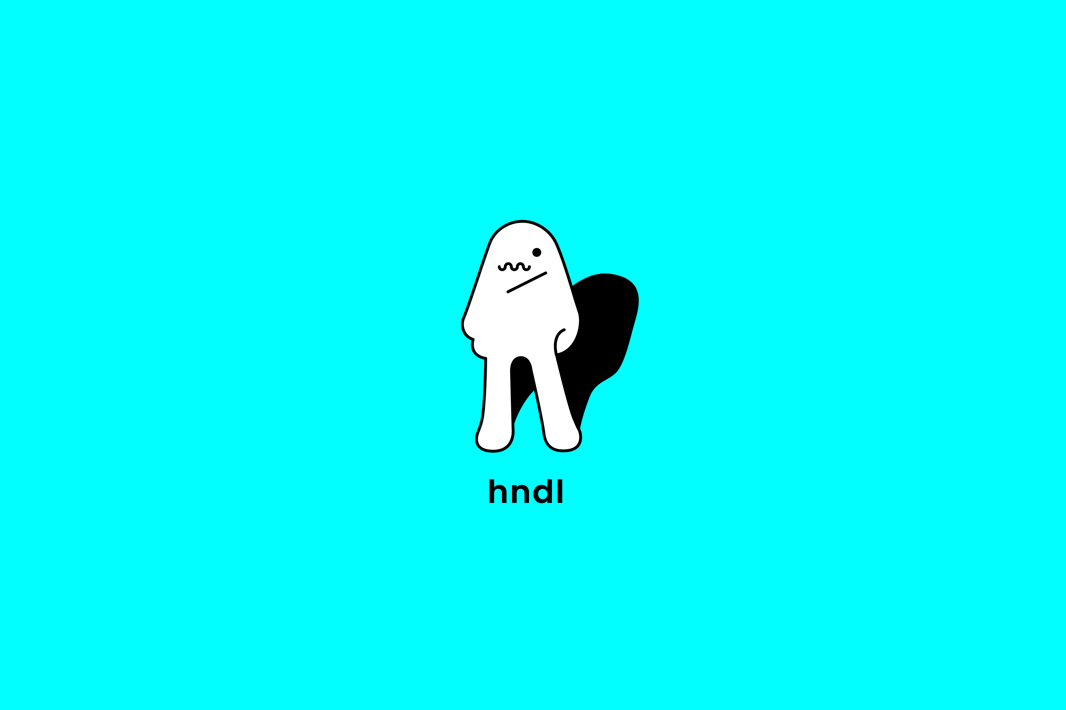
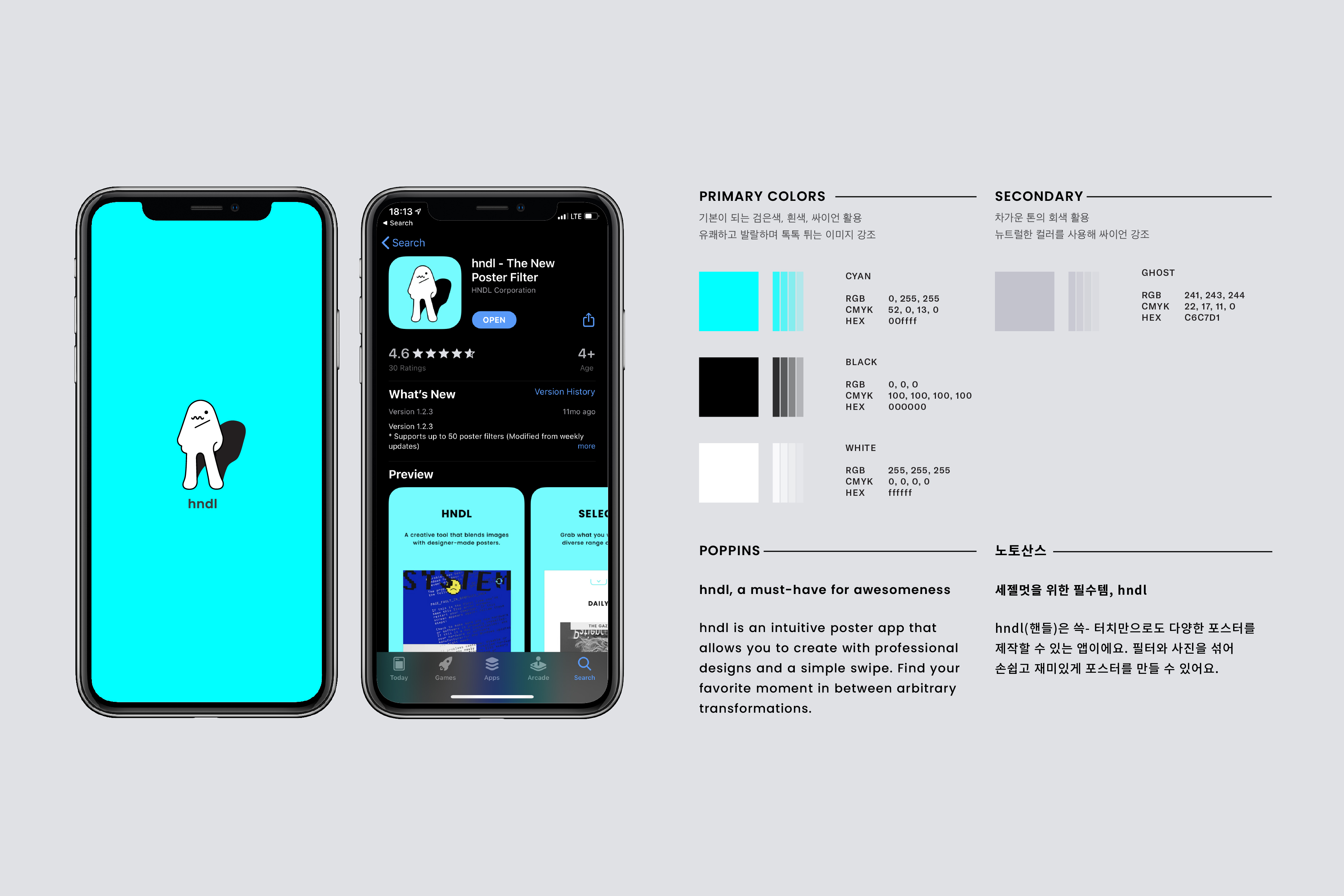
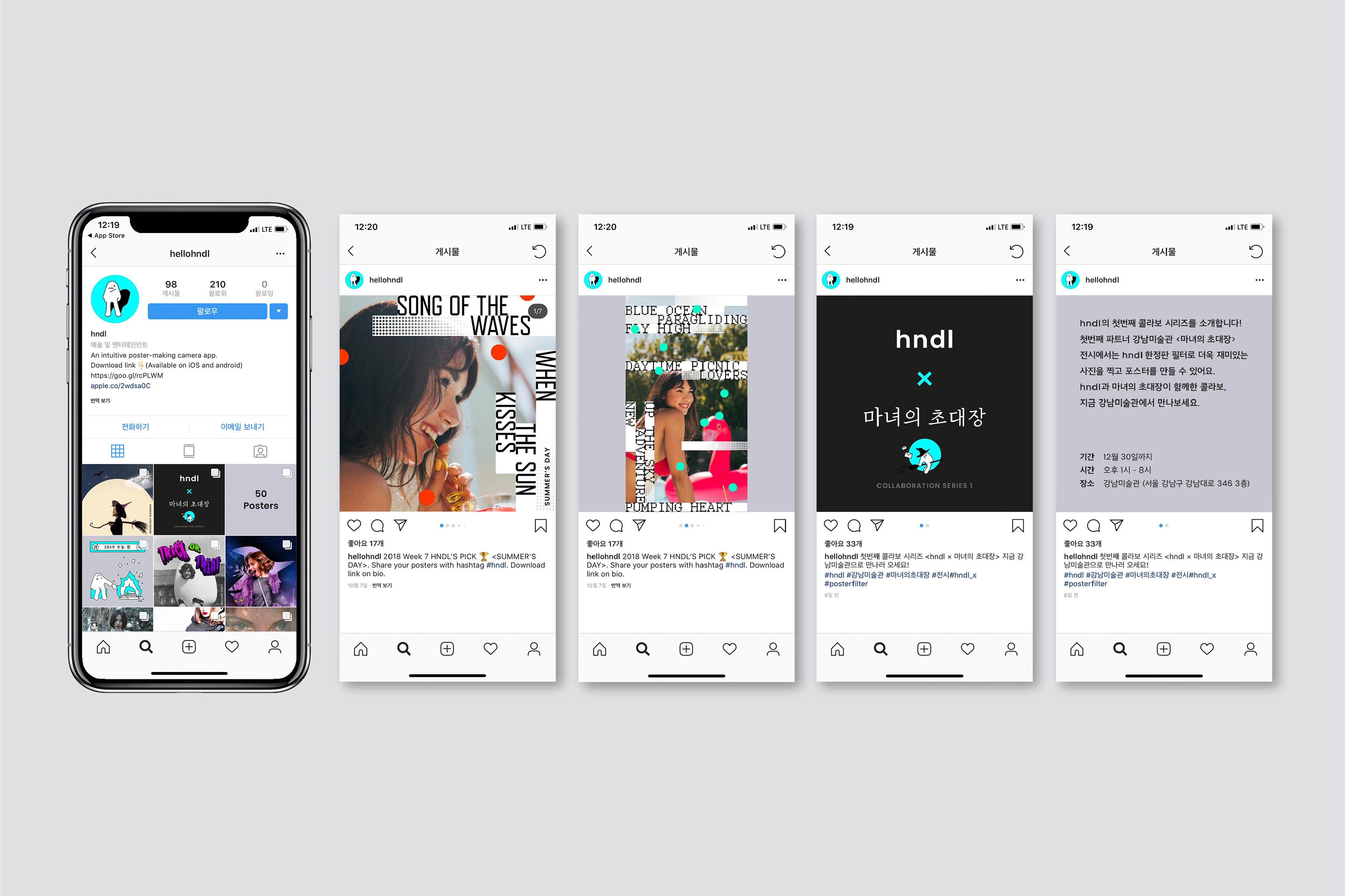
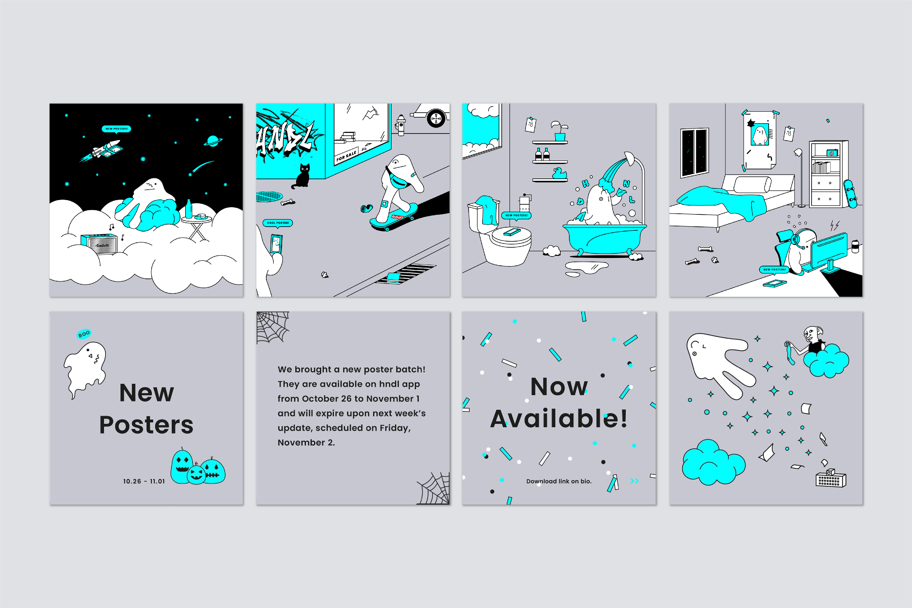
hndl is a photo app that allows users to play with designer-made posters as camera filters. The project aims to build a platform for designers to showcase "animated posters" and promote a novel form of photo/poster culture where anyone can create unique posters. The app is simple, intuitive, and does not require any signup process; Users choose a poster filter, explore variations by simply swiping the screen, and save the outcome at their favorite moment. Targeting female Millennials and Gen Z users, hndl's symbol mark depicts a character that generates a multitude of expressions. The character takes the shape of an upside-down "V" or "Peace," a commonly used hand gesture for selfies. hndl uses "RGB Cyan" as the primary color that only takes a complete form on the screen to celebrate the integration of posters, a long-beloved icon of prints, into the digital platform.
︎ Collaborated with Dahee Kong, Euichul Shin + 4 others including developers and interns.


GUI & Exhibition graphics
I, Us, and the Earth ©2021
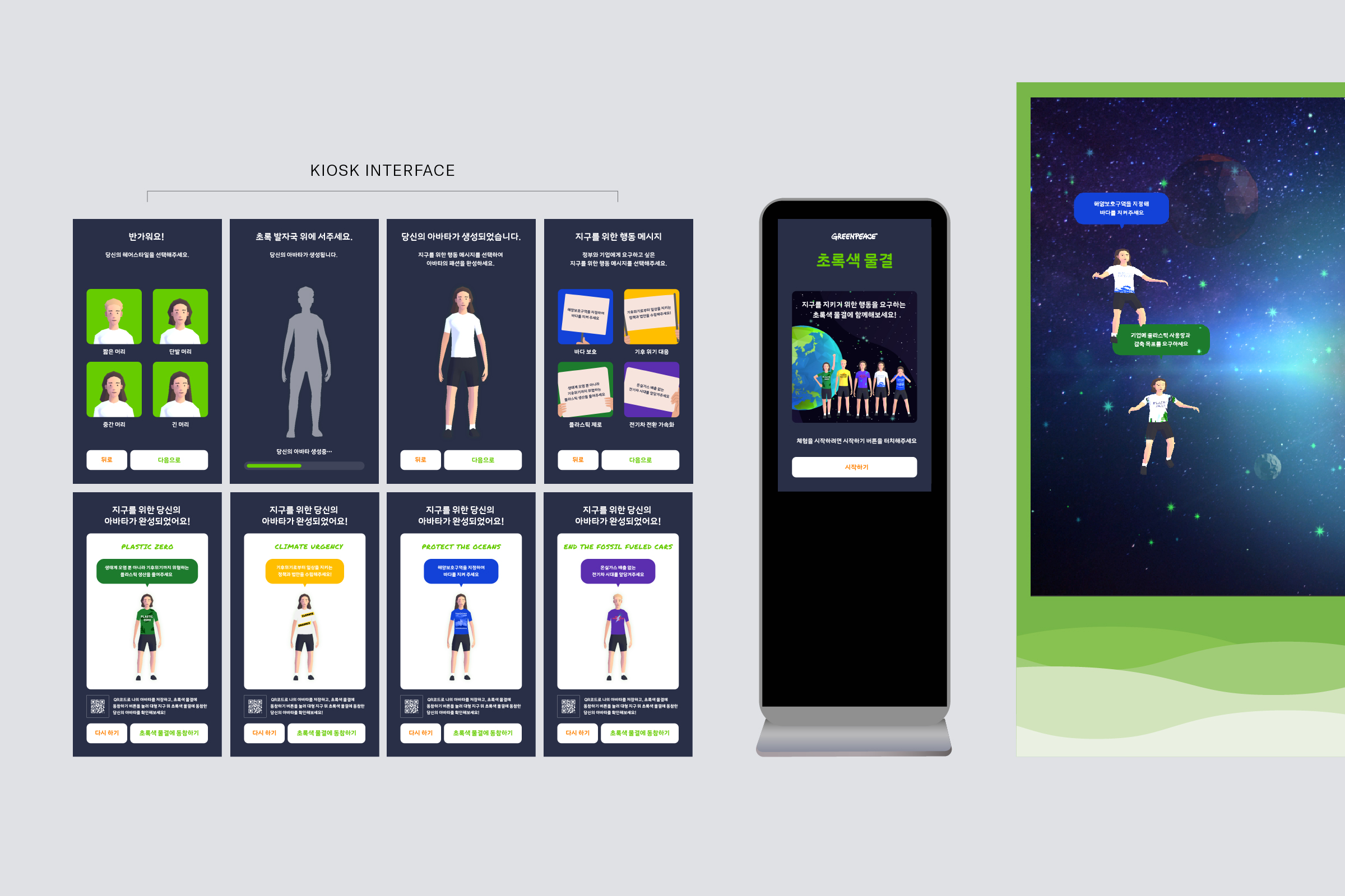
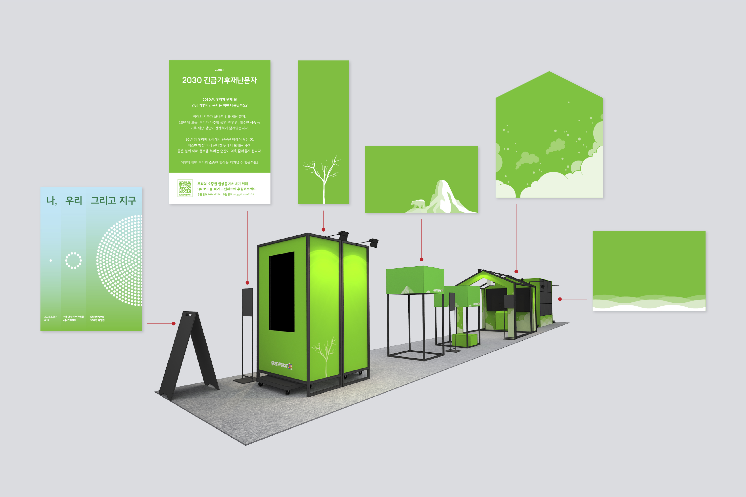
"I, Us, and The Earth" is a media art exhibition hosted by Greenpeace, an international environmental organization, celebrating its 50th anniversary. The exhibition was designed to call attention to the urgency of a dramatic climate change by presenting five different installations to underline this issue. My role was to create overall exhibition graphics and design the GUI for two digital contents. One of them, "Green Wave," was an interactive installation that encouraged audiences to participate in the campaign advocating responses to the climate crisis; When the users create their avatars and choose a slogan through the kiosk stand, their avatars immediately appear on a large screen. For exhibition graphics, the main focus was to visualize issues each installation depicts. The use of the color white symbolizes "repercussions," and the green represents "progress" regarding environmental issues.
︎ Collaborated with Dahee Kong + 8 others including developers, project managers, art director, Unity and motion graphic designers
GUI
Ocean Circulation ©2020
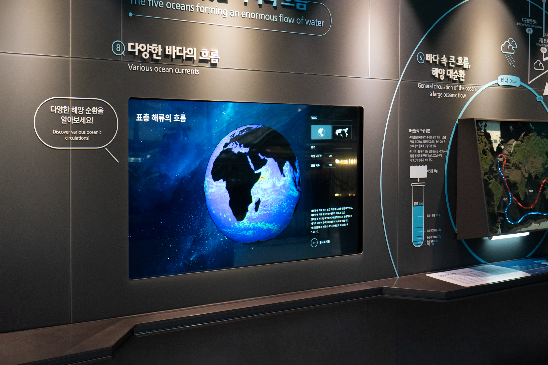
Ocean Circulation is a interactive media content located in the Geoscience section of the National Science Museum, where visitors can find various information on ocean currents such as changes in salt concentrations, movement and temperature of surface currents, changes in sea level wind, and surface currents.
In addition, the flow and name of oceanic circulation flow and ocean current can be found in each menu by on-off button.
︎ Collaborated with Minki Kim and Minju Kim


GUI & Graphic assets
Sungnam Archive ©2018
UI design for "Seongnam Archive," a digital signage built as part of Seongnam City Hall's PR Center rebranding project. "Seongnam Archive" allows users to view key landmarks in Seongnam and relevant information through six multi-screens linked to the kiosk. The kiosk offers six categories with different themes, containing four to six locations, along with the language selection function. The screen displays photos, videos, descriptions, and the location of the landmark when users tap on the selection.
︎ Collaborated with Miji Park and Jaejung Lee
GUI
Ecoquest ©2019
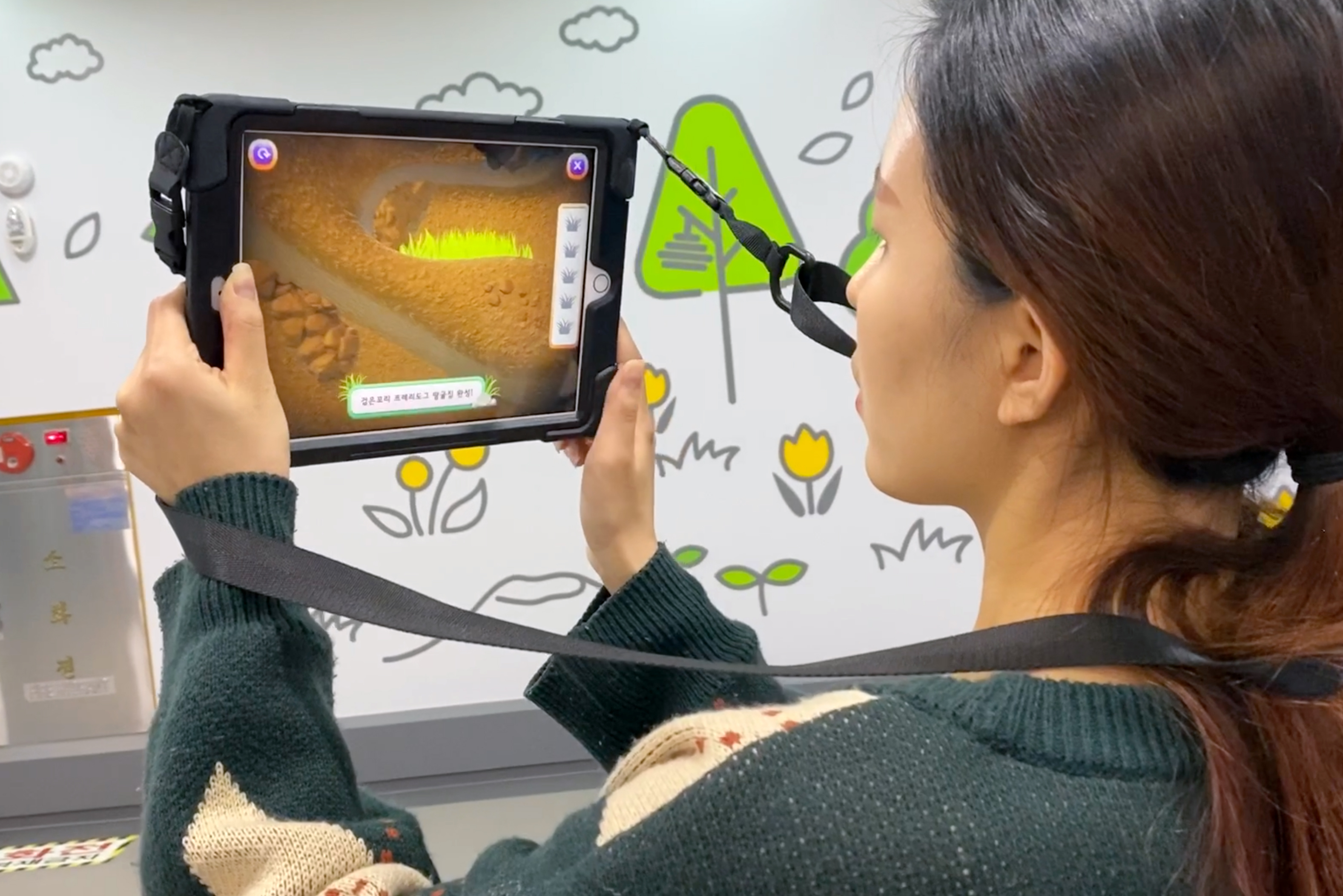
GUI design for Ecoquest, an AR game that can be experienced at the Ecological Media Experience Center of the National Institute of Ecology. The user can choose among black double-headed bees, prairie dogs, or rice paddies to help them build their homes and learn about their habitats.
︎ Collaborated with Dahee Kong + 5 others including developers, project managers, Unity and motion graphic designers.
Digital


BI & GUI
MIA ©2020
MIA is a mobile simulation game designed to highlight the environmental crisis and advocate eco-friendly activities among users via built-in social media that allows sharing and verifying their actions. The story is set in the year 2200 and embarks on a journey with a child called Mia, a lone survivor on a devastated Earth. Mia contacts users in 2020 to ask for immediate actions and stall the tragic future. With this in mind, the BI focuses on conveying the motive and the motif of the game. The use of curves as the central element in the logotype design reflects the morphological structure of nature. Plus, a rotated crossbar in the letter A implicitly illustrates the image of MIA standing alone in the hemisphere. Different shades of purple comprise the GUI color palette to express dystopian Earth as opposed to green, the color of nature.
︎ Collaborated with Dahee Kong + 9 others including developers, project managers, airt director, Unity and motion graphic designers.


CI
MO-ON Company ©2019
Founded in 2015, MO-ON Company is a new media design & communication studio with expertise in a broad range of interactive content, including AR, MR, projection mapping, media façade, media art exhibition, and digital signage. Prior to designing the CI, we redefined and established the company's philosophy and objectives. Through this process, we uncovered that their utmost value lies in "people" regardless of their roles and derived the motto, "Imagination to Experience, Ordinary to Extraordinary." In the final logotype design, we planted a flexible horizontal line between the letters "MO" and "ON" extending across the given surface to bolster the idea of "relationship" and hint at the "infinite" potential the business embraces.
︎ Collaborated with Dahee Kong, Euichul Shin


BI & UI & Poster Design
hndl ©2018
hndl is a photo app that allows users to play with designer-made posters as camera filters. The project aims to build a platform for designers to showcase "animated posters" and promote a novel form of photo/poster culture where anyone can create unique posters. The app is simple, intuitive, and does not require any signup process; Users choose a poster filter, explore variations by simply swiping the screen, and save the outcome at their favorite moment. Targeting female Millennials and Gen Z users, hndl's symbol mark depicts a character that generates a multitude of expressions. The character takes the shape of an upside-down "V" or "Peace," a commonly used hand gesture for selfies. hndl uses "RGB Cyan" as the primary color that only takes a complete form on the screen to celebrate the integration of posters, a long-beloved icon of prints, into the digital platform.
︎ Collaborated with Dahee Kong, Euichul Shin + 4 others including developers and interns.


GUI & Exhibition graphics
I, Us, and the Earth ©2021
"I, Us, and The Earth" is a media art exhibition hosted by Greenpeace, an international environmental organization, celebrating its 50th anniversary. The exhibition was designed to call attention to the urgency of a dramatic climate change by presenting five different installations to underline this issue. My role was to create overall exhibition graphics and design the GUI for two digital contents. One of them, "Green Wave," was an interactive installation that encouraged audiences to participate in the campaign advocating responses to the climate crisis; When the users create their avatars and choose a slogan through the kiosk stand, their avatars immediately appear on a large screen. For exhibition graphics, the main focus was to visualize issues each installation depicts. The use of the color white symbolizes "repercussions," and the green represents "progress" regarding environmental issues.
︎ Collaborated with Dahee Kong + 8 others including developers, project managers, art director, Unity and motion graphic designers

GUI
Ocean Circulation ©2020
Ocean Circulation is a interactive media content located in the Geoscience section of the National Science Museum, where visitors can find various information on ocean currents such as changes in salt concentrations, movement and temperature of surface currents, changes in sea level wind, and surface currents.
In addition, the flow and name of oceanic circulation flow and ocean current can be found in each menu by on-off button.
︎ Collaborated with Minki Kim and Minju Kim


GUI & Graphic assets
Sungnam Archive ©2018
UI design for "Seongnam Archive," a digital signage built as part of Seongnam City Hall's PR Center rebranding project. "Seongnam Archive" allows users to view key landmarks in Seongnam and relevant information through six multi-screens linked to the kiosk. The kiosk offers six categories with different themes, containing four to six locations, along with the language selection function. The screen displays photos, videos, descriptions, and the location of the landmark when users tap on the selection.
︎ Collaborated with Miji Park and Jaejung Lee

GUI
Ecoquest ©2019
GUI design for Ecoquest, an AR game that can be experienced at the Ecological Media Experience Center of the National Institute of Ecology. The user can choose among black double-headed bees, prairie dogs, or rice paddies to help them build their homes and learn about their habitats.
︎ Collaborated with Dahee Kong + 5 others including developers, project managers, Unity and motion graphic designers.




Art direction & Book design
BB2 ©2017
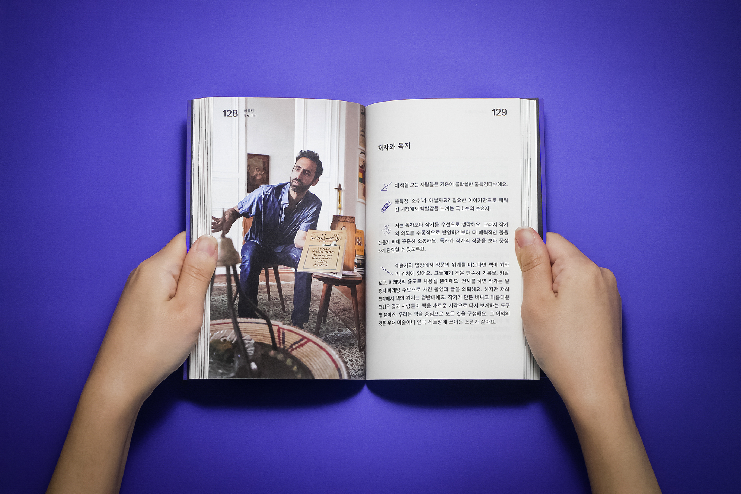
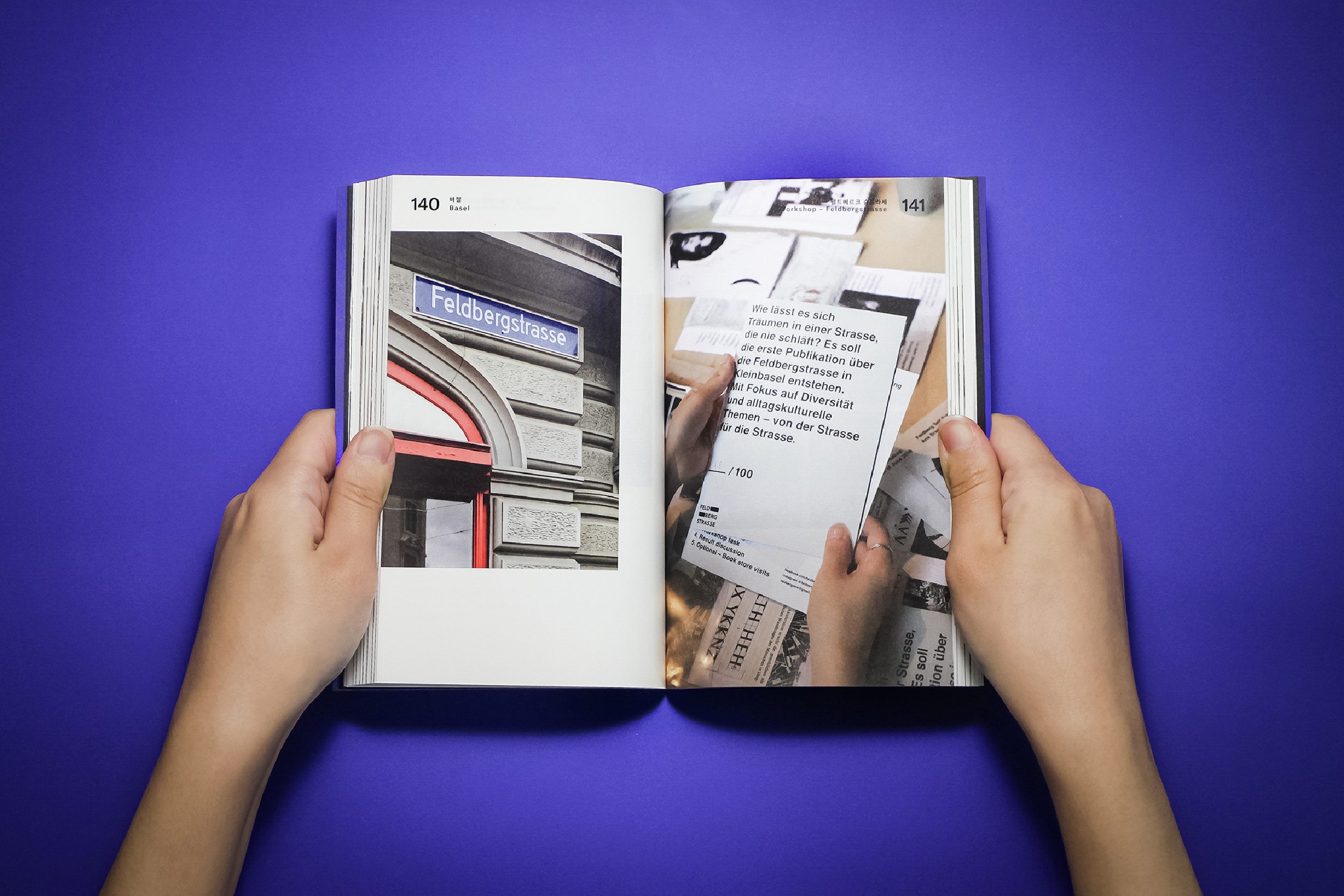
"BB2: From Bremen To Basel" was created as a part of Paju Typography Institute's regular curriculum, 'Design on the Road.' The project took place in three cities of Switzerland and Germany to explore the microcosm of independent publications through encounters made outside of the classroom. The experience was later documented as a publication, which primarily consists of three parts: interviews, workshops, and art book fairs. Independent interviews were conducted with individuals and collectives from various professional fields—self-publishers, bookshop owners, independent book project members, writers, artist book collectors, and book fair hosts—who were directly or indirectly connected to the subject matter. The contents were later recomposed under 12 different keywords. Although the project was initiated to scrutinize the independent publishing scene, the outcome of this exploration questions the role of the book and its possibility beyond.
︎ Collaborated with Eunjung Kwak, Gaeul Shin, Jiyeon Lee
115 x 178, Offset, 256pg




Book design & Illustration
In-betweed State ©2016
In-betweed State is an attempt to show one’s intercultural experience into a form of book. The book contains two different stories, a cartoon dealing with cannabis culture of America and a monologue describing the perceptions of marijuana in Korea; The one is enclosed inside of french-folded pages while the other is not. As the reader decides to tear up the perforation and see the hidden content—enter the other culture—the book loses its original quality and transforms from monotone to color, french folding to perfect binding and monolingual to bilingual.
The book was presented in Next Generation, a Master Thesis exhibition at the Basel School of Design.
︎ Designed with the instruction of Arno Schubbach, Marion Fink and Machael Renner.
170 x 210, Flatbed, 80p






Co-author & Editing
BB: From Bremen To Basel ©2014
BB: From Basel To Bauhaus is a documentation of the 10-day trip in Switzerland and Germany. The book contains 319 photos and 63 essays about people, design studios, workshop experiences, lectures, museum tours and archives that are closely and loosely connected to the theme of modern typography. BB: From Basel To Bauhaus was a collaborative work and was created as part of “Design on the Road”, a regular curriculum of the Paju Typography Institute.
︎ Designed with the instruction of Park Hwal-Sung and Kim Hyung-Jin from Workroom Press.
115 x 178, Offset, 400pg


Exhibition graphic
Imgainary Zoo ©2018
Exhibition graphics for "Imaginary Zoo," a media art exhibition held at Gyeongju World Culture Expo portraying animals from traditional folk paintings through digital art. The poster at the entrance was designed by composing the exhibition title with illustrations of folktale animals. "Ahnsangsoo," one of the most notable Korean typefaces for breaking the square format, was used to honor the originality of the imaginary creatures. The labels in the interior space were designed with a calligraphic serif reminiscent of ancient writings and left-justified to accentuate traditionality and order.
︎ Collaborated with Dahee Kong, Jungsu Moon


Installation
Must I Go This Far? ©2014
Must I Go This Far? is an installation series reinterpreting the experience of marijuana, a strict taboo in the realm of Korean culture.
Each part represents one’s past experience about, current fear of and future planning for encountering, raising and handling the subject; These aspects are portrayed through Archive Panel; a collection of personal objects, Sweet Tooth; an imaginary urine/drug testing room and Alex’s Room; a recreation of the private dormatory room.
Must I Go This Far? was presented in 1 PaTI, a Master Thesis exhibition at the Paju Typography Institute.


Poster design
JIFF ©2020, 2019, 2017, 2015
100 Films and 100 Posters is a poster festival hosted by the Jeonju International Film Festival and organized by GRAPHIC since 2015, where a hundred graphic designers create posters for a hundred films invited to the festival. The event aims to "encourage imagination and experimentation free from rules and customs of commercial posters, and focus on redefining the identity of the film beyond the essence of the poster as information vessels." From the top, each poster is designed based on the film "Anne at 1,300ft," "The Return," "Corniche Kennedy," and "A Courtesan with Flowered Skin."
600 x 900, Offset


Poster design
Rebirth ©2015
Poster created to celebrate the 50th anniversary of the Daemuna Academy. Highlighting the institution’s new beginning, the poster was titled and designed from the word, “rebirth”. Rebirth was presented in Yesterday’s Planet exhibition which was hosted and directed by the Takeout Drawing & Museum and the Everyday Practice design studio.
841 x 1189, Inkjet


Poster design
Typodance ©2013
Poster for the dance performance presented in the opening ceremony of Seoul International Typography Biennale, Typojanchi. The concept was to use type to capture the process of translating letterforms into body movements. Typo Dance was featured in Computer Arts Collection: Graphic Design Annual 2014.
594 x 841, Inkjet